| Archive directory | Delisting archive | Replacement archive | Obsolete archive | 20 | 21 | 22 | 23 |
_equipped.png)
![1.25 [[:File:Cockroach soldier in habitat.png]]](#[[:File:Cockroach_soldier_in_habitat.png]])
Nominations for delisting
TzTok-Jad
Reason: - Breaks the guideline: The image is taken from RuneScape game client.
- Support Neutral - Tollerach made a good point. I support delisting after replacement images are chosen. And was the guideline made after featuring?
- REDIRECT User:Dictature/Signature 22:24, 10 April 2009 (UTC) 13:19, 11 April 2009 (UTC)
- Oppose - The criteria listed have not been put through consensus or otherwise approved by anyone other than AZ. Besides, all of the images I submitted which have been supported unanimously do not meet the current criteria.
 TEbuddy 22:39, 10 April 2009 (UTC)
- Oppose - The guidelines were put in place to get this up and running. I disagree with this guideline at this time. Until we have several good game client images, I say we leave these images in. Besides, they look good.
 Tollerach hates SoF 23:05, 10 April 2009 (UTC)
 - Oppose - Once we have more ingame images, then it can come down. @Gaz#7521 11:35, 15 April 2009 (UTC)
- Closed - Nomination is unsuccessful. az talk 11:39, 17 April 2009 (UTC)
Guthix

Reason: - Breaks the guideline: The image is taken from RuneScape game client.
- Support Neutral - Tollerach made a good point. I support delisting after replacement images are chosen. And was the guideline made after featuring?
- REDIRECT User:Dictature/Signature 22:26, 10 April 2009 (UTC) 13:19, 11 April 2009 (UTC)
- Oppose - The criteria listed have not been put through consensus or otherwise approved by anyone other than AZ. Besides, all of the images I submitted which have been supported unanimously do not meet the current criteria.TEbuddy 22:39, 10 April 2009 (UTC)
- Oppose - The guidelines were put in place to get this up and running. I disagree with this guideline at this time. Until we have several good game client images, I say we leave these images in. Besides, they look good. Tollerach hates SoF 23:05, 10 April 2009 (UTC)
- Oppose - I must admit, its a good image. Leave it until we have more ingame images. @Gaz#7521 11:35, 15 April 2009 (UTC)
- Closed - Nomination is unsuccessful. az talk 11:39, 17 April 2009 (UTC)
Avatar of Creation(1)
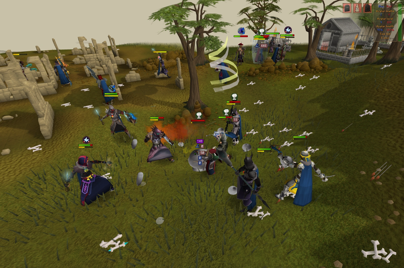
Description: A battle for the Avatar of Creation at Soul Wars.
Reason: Too cluttered with players, the health bars and various prayers don't look good.
- Support deletion - As nominator. Lvl 3 skils3 Talk~ Holiday Signup ~Hiscores 01:21, 21 April 2009 (UTC)
- Opose deletion - It's one of the best images i've seen :) Dindirindin!!!
- Oppose - This picture isn't just about the Avatar, but it helps. We get a nice view of the Avatar, as well as the chaos of Soul Wars; and it's not like the HP bars are taking up the majority of the screen. Admittedly, it is a tiny bit cluttered with the Prayers and HP Bars, but not to the point where it detracts from the image immensely. -- Pikaandpi Berserker Fury! 14:57, 21 April 2009 (UTC)
- Comment - If a replacement image is found, the image can be nominated under "Nominations to replacement"
az talk 12:22, 22 April 2009 (UTC)
- Support replacement - If you can find a tie Soul Wars world, I'm sure you can find one that isn't so cluttered. Tehnoobshow101 18:33, 24 April 2009 (UTC)
- I'm free-to-play. Lvl 3 skils3 Talk~ Holiday Signup ~Hiscores 05:17, 25 April 2009 (UTC)
- Support replacement - If a better photo is taken I support replacement.-- Talk! Quest! x Tim x Sign! Edit # 19:26, 25 April 2009 (UTC)
- Closed - Image has been nominated for replacement. az talk 09:22, 27 April 2009 (UTC)
TzTok-Jad (2) and Guthix (2)
Previous nomination: See above.
Reason: These images were not taken from RuneScape game client, and are used under "Fair use". These were one of the first few images to be featured on the Main Page. Now that we have about 30+ images, I think it is time that we removed them.
- Support - as nominator. az talk 16:55, 20 June 2009 (UTC)
- Support Jad, Neutral about Guthix - I never liked Jad's image anyways. You can't even see him very well. The Guthix image is nice (maybe replace it with an image of Guthix during Meeting History?). Oil4 Talk 17:15, 20 June 2009 (UTC)
- Support both - Per nominator; they really were only kept as there wasn't many featured images at the time. Now there's more we should apply the rules to them, and delist them. @Gaz#7521 18:18, 20 June 2009 (UTC)
- Support Both - Finally! Nephilim Retired
- Support both - per Azliq. C.ChiamTalk 08:37, 21 June 2009 (UTC)
- Support both - per nom. Powers38 おはようヾ(´・ω・`) 10:16, 21 June 2009 (UTC)
- Support both Sorry, but they were always a bit... I dunno. They just didn't seem well. Especially Guthix. —The preceding unsigned comment was added by 4ndrepd (talk).
- Support both - For the reason explained in the description
- Support both - Per nom. Gragon 126 Talk 00:51, 23 June 2009 (UTC)
- Support both - Per nom. Mo 55 55 Talk|Sign 18:00, 25 June 2009 (UTC)
- Support both - Per nom. Runeueins Talk # 07:25, 26 June 2009 (UTC)
- Closed - Both images are delisted from the Featured images list. az talk 20:09, 26 June 2009 (UTC)
Zanik

Reason: In my opinion, the image doesn't diserve to have a place in the first page...The quality seems like its 2nd category.
- Support - As nominator
- Weak Support - It's true, the quality of this picture can't match the quality of the others now, but I still <3 Zanik. Nephilim Retired 13:57, 24 June 2009 (UTC)
- Sorry, but the image criteria is only about quality,size etc ...If you love or not the npc does not metter for the voting and it will take as a comment.
- Support - To be honest, I was contemplating nominating it myself. We have a lot more featured images now which I feel greatly exceed this image in quality. C.ChiamTalk 14:03, 24 June 2009 (UTC)
- Support - ITS HORRIBLE. Yuck! Gragon 126 Talk 15:31, 24 June 2009 (UTC)
- Support - As said before, it lacks the large quality and detail than the other images. When you look at this, the first word in your mind will most likely not be "wow!" ~MuzTalk 15:33, 24 June 2009 (UTC)
- It will be "eek!" Gragon 126 Talk 15:35, 24 June 2009 (UTC)
- Support - I never really liked it anyway. She looks scary! Oil4 Talk 19:02, 24 June 2009 (UTC)
- Support - It doesn't look good on main page, I don't think any npc chatheadi image ever will look good on main page. Secondly I don't even think that it's so good image, that deserves nomination of Featured Image. Runeueins Talk # 07:19, 26 June 2009 (UTC)
- Comment - If a guy that plays wow or some oter game like that opens runescape wiki and see this image it will certanly say: omfg runescape realy sucks 11:25, 27 June 2009 (UTC)
- Closed - Image is delisted from the Featured images list. az talk 18:33, 29 June 2009 (UTC)
Brassica Prime

Description: All hail Brassica Prime!
Reason: It shows the size of the cabbage god compared to the player but the colours are a bit dull and dead.
Old nomination - Found here.
- Support Delisting - As nominator. --— Enigma 16:50, 4 August 2009 (UTC)
- Support Delisting - It's a pointless picture, it's just a huge cabbage and a player with some sparkles. >_> Nephilim Retired
- Support Delisting - It should be removed from the featured images but not from the wiki, because it is a discontinued event. Gragon 126 Talk 17:06, 4 August 2009 (UTC)
- Support Delisting - Per Requiem and Gragon. --George10 98 04:36, 5 August 2009 (UTC)
- Support Delisting - Per Requiem, pointless image. Mo 55 55 Talk|Sign 08:19, 5 August 2009 (UTC)
- support delisting - Per all... and the player ruins it 08:32, 5 August 2009 (UTC)
- Comment - Just a note to you all. Most of the images here don't really have any point, featured images are chosen based on image quality. C.ChiamTalk 08:40, 5 August 2009 (UTC)
- Support Delisting - Its not that great an image, and as said before, seeing the player there ruins it http://i631.photobucket.com/albums/uu33/Psycho_Robot/Sigs%20and%20Avatars/kitty.pngPsycho Robot talk 14:22, 12 August 2009 (UTC)
- Closed - Nomination for delisting is successful. C.ChiamTalk 14:29, 12 August 2009 (UTC)
Dagganoth Prime

Reason The picture is taken from the runescape website (the original uploader of this picture didn't take the picture, he "robbed" from Jagex) and the Dagganoth claw looks blured.
Original nomination: RuneScape:Featured images/archive1#Dagannoth_Prime
- Check http://www.runescape.com/c=3ZuvmPJsjJc/kbase/guid/waterbirth_island_dungeon_members
- Support - As Nominator 18:08, September 6, 2009 (UTC)
- Support - Per nominator, monster images are boring - also, you misspelled 'robbed' in the reason section. Nephilim Retired
- Comment - Lol im portuguese... so my english sucks a little. :D 09:25, September 7, 2009 (UTC)
- Support - Looks pretty bad, and that's not surprising since it came from the Knowledge Base! http://i631.photobucket.com/albums/uu33/Psycho_Robot/Sigs%20and%20Avatars/kitty.pngPsycho Robot talk 00:22, September 7, 2009 (UTC)
- Support - It's from the Knowledge Base! ~MuzTalk 03:03, September 7, 2009 (UTC)
- Support - Per Muzzy - -- Nightgunner Talk 03:36, September 7, 2009 (UTC)
- Support - Per nom. Oil4 Talk 16:07, September 7, 2009 (UTC)
- Support - Per Oli. Mo 55 55 Talk|Sign 14:23, September 9, 2009 (UTC)
- Support - I don't see why we have to wait like 6 days to get this removed from featured images, it MUST be deleted without a nomination for delisting. This is just my opinion and I think it should be like that. Gragon 126 Talk 02:07, September 10, 2009 (UTC)
- Support - I don't really like monster images, I think only pictures of scenery should be FIMG. --Captain Sciz 18:43, September 10, 2009 (UTC)
- Closed - Nomination for delisting is successful. C.ChiamTalk 07:22, September 13, 2009 (UTC)
Fishing Guild
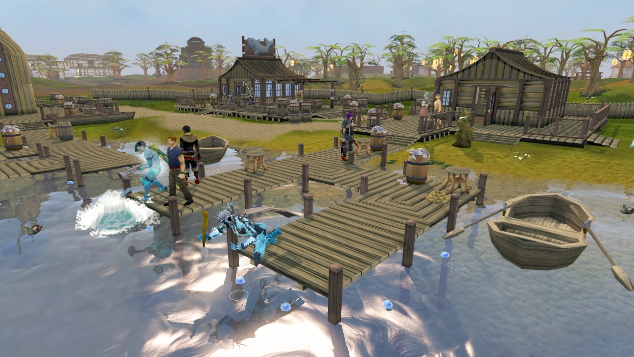
Reason - This image isn't really scenery, it's not of a boss monster, but it's a dock with players fishing in it. I don't like this image, as it doesn't show anything epic like the dragon forge, or anything like that. It's basically just some dock with players fishing. You can't even tell it's the Fishing guild.
Original nomination: RuneScape:Featured images/archive1#Fishing_Guild
- Support As nom. --Captain Sciz 18:52, September 10, 2009 (UTC)
- Oppose - There's more to RuneScape than monsters and ancient ruins. This picture is a very nice picture of the communal aspect to the game. http://i631.photobucket.com/albums/uu33/Psycho_Robot/Sigs%20and%20Avatars/kitty.pngPsycho Robot talk 19:45, September 10, 2009 (UTC)
- Oppose - Although this picture isn't the best, it captures the community of RS at it's best, something some pictures can't do. Nephilim Retired
- Oppose - It's lovely. Gragon 126 Talk 15:47, September 12, 2009 (UTC)
- Strong Oppose - I really like it. It isn't the very best picture in terms of beauty, but it captures the daily lives of many players, and it shows what most people do on RuneScape, which is training their skills and making money. Oil4 Talk 15:55, September 12, 2009 (UTC)
- Oppose - I really like the rich shade of blue, it's what makes it a nice picture. — Enigma 21:57, September 14, 2009 (UTC)
- Closed - Nomination for delisting is unsuccessful. C.ChiamTalk 11:49, September 17, 2009 (UTC)
Gu'tanoth
Reason: This image is rather dull, it doesn't really show anything either. All it is is dead colours mixed with more dead colours.
Original nomination: RuneScape:Featured images/archive2#Gu'Tanoth
- Support - As nom. — Enigma 21:57, September 14, 2009 (UTC)
- Support - There's a huge void of action and content right in the center of the image, and it isn't very pleasing to look at. http://i631.photobucket.com/albums/uu33/Psycho_Robot/Sigs%20and%20Avatars/kitty.pngPsycho Robot talk 02:48, September 15, 2009 (UTC)
- Oppose - I like this image as it looks very relistic and shows off RuneScape's grahics. Dockywho • Talk 14:52, September 16, 2009 (UTC)
- Support - Per nominator. Runeueins Talk # 16:45, September 16, 2009 (UTC)
- Oppose - Quoting Pika: we need some more pictures of different races across RuneScape (aside from some Humans in most of our featured images, the Goblins in the Chosen Commander Image, and various enemies throughout many of our screens, we lack different races). I agree wholeheartedly. I don't agree that this image is dull, it has some nice detail and is overall, a very interesting picture. C.ChiamTalk 11:48, September 17, 2009 (UTC)
- Oppose - It's just awesome to look at. It's better than most location images... Hapi007 Talk! Sign! . 10:19, September 19, 2009 (UTC)
- Then why Oppose? Maybe I'm not getting the sarcasm...? Gragon 126 Talk 15:21, September 21, 2009 (UTC)
- He's opposing it being delisted i.e. supporting it remaining listed. @Gaz#7521 17:49, September 22, 2009 (UTC)
- Yes lol sorry didn't read the "nominations for delisting" thing. Gragon 126 Talk 01:04, September 23, 2009 (UTC)
- He's opposing it being delisted i.e. supporting it remaining listed.
- Then why Oppose? Maybe I'm not getting the sarcasm...? Gragon 126 Talk 15:21, September 21, 2009 (UTC)
- Weak Support - I don't really know. There's the fact that it's dull and the ogres look like their really tired and CBA'ed to do anything. But then there's the fact that having pictures of monsters in their habitats are good... Nephilim Retired
- Notice of intent - Nomination for delisting is extended by a week to 28 September 2009. C.ChiamTalk 12:17, September 21, 2009 (UTC)
- Oppose - I can't see what is wrong with it. It is a good image of Ogres. Evil Yanks talk 08:05, September 26, 2009 (UTC)
- Oppose - It's perfectly fine. Oil4 Talk 15:39, September 28, 2009 (UTC)
- Weak Oppose - It seems pretty good.. bad_fetustalk 18:35, September 28, 2009 (UTC)
- Closed - Nomination for delisting is unsuccessful. C.ChiamTalk 06:59, September 29, 2009 (UTC)
Bandos' throne room
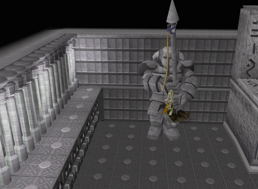
Reason: One thing ruins this picture for me. Zanik. She is on of the most well known, favorite NPCs in RuneScape, but her graphics let her down. Untill she gets her graphics update, she will ruin this picture, as she sticks out. If anyone finds a image of this place without Zanik, we can use it to replace this one. She just sticks out like a sore toe.
Previous nomination: RuneScape:Featured images/archive3#Bandos' throne room
- Support - As nominator. Dockywho • Talk 08:15, November 24, 2009 (UTC)
- Weak support - Though I like the area and Zanik looks like a yellow and brown dot on thumbnail, dots can be evil >:D OMG!!!!! ------> . -- http://i1016.photobucket.com/albums/af290/porp109/sig1.png Spam me w/ lolcats Is <insert name here> awesome? I don't know, let me check... 11:10, November 24, 2009 (UTC)
- Support - I agree, I don't like this picture greatly, for a featured image... and yes, Zanik sticks out, just too much. Jhanely
- Support - I dnno, I just don't like it... --Captain Sciz 03:09, November 27, 2009 (UTC)
- Support - ...what's happening? A goblin standing on a statue. Hoo-ray. User:Lil diriz 77/Signatures 23:45, November 27, 2009 (UTC)
- Support - Its very unattractive http://i631.photobucket.com/albums/uu33/Psycho_Robot/Sigs%20and%20Avatars/kitty.pngPsycho Robot talk 22:15, November 28, 2009 (UTC)
- Support - I don't like it. It's just some pixels (it looks very pixelated) with some different colours and a blob of some other colours in the middle. Oil4 Talk 22:16, November 28, 2009 (UTC)
- Support - I don't like it either Gragon 126 Talk 22:39, November 28, 2009 (UTC)
- Support - Who even nominated this -.- It's horrible -- « Gloria » 03:31, November 29, 2009 (UTC)
- Hapi did -- http://i1016.photobucket.com/albums/af290/porp109/sig1.png Spam me w/ lolcats Is <insert name here> awesome? I don't know, let me check... 19:48, November 29, 2009 (UTC)
- No need to point fingers, we all have the right to our opinion. User:Lil diriz 77/Signatures 20:50, November 29, 2009 (UTC)
- I'm not pointing fingers, I'm just telling missy who nominated the original; by the way, that was a unanimous decision -- http://i1016.photobucket.com/albums/af290/porp109/sig1.png Spam me w/ lolcats Is <insert name here> awesome? I don't know, let me check... 22:14, November 29, 2009 (UTC)
- I was talking to the both of you somewhat To Missy, saying that is kinda rude to the person who nominated it, and to Porp, that's kinda rude to say it out loud (however, you wouldn't have said it in the first place if Missy hadn't asked ). No big deal. User:Lil diriz 77/Signatures 04:08, November 30, 2009 (UTC)
- I was talking to the both of you somewhat
- I'm not pointing fingers, I'm just telling missy who nominated the original; by the way, that was a unanimous decision -- http://i1016.photobucket.com/albums/af290/porp109/sig1.png Spam me w/ lolcats
- No need to point fingers, we all have the right to our opinion. User:Lil diriz 77/Signatures 20:50, November 29, 2009 (UTC)
- Hapi did -- http://i1016.photobucket.com/albums/af290/porp109/sig1.png Spam me w/ lolcats
- Comment - Here's a sxier image. --Iiii I I I 02:36, November 30, 2009 (UTC)
- AMG YES. User:Lil diriz 77/Signatures 04:08, November 30, 2009 (UTC)
- YES! FTW! --Captain Sciz 19:35, November 30, 2009 (UTC)
- CHEESE PUFFS!!!!! (and yes)-- http://i1016.photobucket.com/albums/af290/porp109/sig1.png Spam me w/ lolcats Is <insert name here> awesome? I don't know, let me check... 01:38, December 1, 2009 (UTC)
- CHEESE PUFFS!!!!! (and yes)-- http://i1016.photobucket.com/albums/af290/porp109/sig1.png Spam me w/ lolcats
- YES! FTW! --
- AMG YES. User:Lil diriz 77/Signatures 04:08, November 30, 2009 (UTC)
- Closed - Delisted. http://i631.photobucket.com/albums/uu33/Psycho_Robot/Sigs%20and%20Avatars/kitty.pngPsycho Robot talk 02:38, December 1, 2009 (UTC)
Wise Old Man

Original nomination: RuneScape:Featured images/archive1#Wise Old Man
Reason: The image just isnt that good, the edges of the wise old man are jagged, the background looks bland, the rocks to the right are very poorly textured and the nearest rock looks like its levitating. Overall not an image of the standard of the other featured images.
- Support As nominator. Timwac talk 09:05, April 15, 2010 (UTC)
- Weak Oppose - I can see why you want this to be delisted, but I still find the image great. bad_fetustalk 09:11, April 15, 2010 (UTC)
- Support - As the standard of featured image rose, the original featured images began looking worse and worse. Evil Yanks talk 10:14, April 15, 2010 (UTC)
- Weak support Per Evil Yanks. (rofl!) But Dionysius looks pretty good.
 Fswe1
Fswe1  14:06, April 15, 2010 (UTC)
 - Support - because it's been edited in Photoshop. it's Vibo talk 18:10, April 15, 2010 (UTC)
- Comment - Why not replace it? Murd3rlogistTalk• Contribs • Sign here 03:36, April 16, 2010 (UTC)
- Support - per all 3rd age farcaster 15:15, April 16, 2010 (UTC)
- Closed - Nomination for delisting is successful. C.ChiamTalk 14:09, April 22, 2010 (UTC)
Baby blue dragon

Reason: This picture is not very detailed. The eyes are especially lacking, since they are just splotches of red. This image looks fuzzy from afar, and weird up close. It is not good enough to be a FIMG.
Original nomination: RuneScape:Featured images/archive1#Baby dragon (pet)
- Support - As nominator. --LiquidTalk 14:11, May 21, 2010 (UTC)
- Support - It has good detail, but lacks everything else. It's an image from the first archive, where even images from the KB were featured... this is definitely not as good as FIMG's now. Fswe1 14:38, May 21, 2010 (UTC)
- Strong Oppose - It has great detail, and I would certainly support it if it was nominated now. bad_fetustalk 14:46, May 21, 2010 (UTC)
- Support - Per Liquid, and also it has bad transparency around the edges
- REDIRECT User:LordDarkPhantom/Signature 16:48, May 21, 2010 (UTC)
- Neutral - I don't like the head or feet, but the rest of the image looks great. Zap0i Talk 04:02, May 22, 2010 (UTC)
- Oppose - I think the details are there, and it's cute ^_^ Lil cloud 9 Talk 11:22, May 22, 2010 (UTC)
- Support - It's fuzzy. Per nom. User:Stelercus/Signature 12:31, May 22, 2010 (UTC)
- Support - It's not high enough quality for FIMG. HaloTalk 12:33, May 22, 2010 (UTC)
- Support - It's just weird looking.
- REDIRECT User:Swizzl3d/Sig 19:08, May 22, 2010 (UTC)
- Support - The edges are fuzzy, and contain artefacts. It's horns look odd, and it just isn't high-quality anymore compared to the other wonderful things we can now do with the Orb of oculus. User:Lil diriz 77/Signatures 23:12, May 22, 2010 (UTC)
- Support - As per all Rhys Talk 13:56, May 26, 2010 (UTC)
- Closed - Image will be delisted. --LiquidTalk 18:44, May 28, 2010 (UTC)
Avatar of Creation
Reason: Very outdated and has been for a very long time. It is a bit choppy and does not focus on the topic of the article.
Original nomination: RuneScape:Featured images/archive1#Avatar of Creation
- Support - As nominator. Evil1888 Talk A's L 23:39, May 25, 2010 (UTC)
- extreamly strong support - hp bars. prayers. players. hitsplats. hp bar showing threw stuff. a monster that looks llike its about 2 throw up on the camera. how much worse could it get? horrible, rotten image, worst featured image ever. EVER. 3rd age farcaster 23:46, May 25, 2010 (UTC)
- Support - Players, HP bars, hitsplats INSIDE the Avatar, urgh, make it stop! Fswe1 05:35, May 26, 2010 (UTC)
- Massive support - Wasn't this requested for delisting a while back and eventually kept for some stupid reason? Featured images people? Hello? Rhys Talk 14:01, May 26, 2010 (UTC)
- Very Strong Support - Per others. bad_fetustalk 14:31, May 26, 2010 (UTC)
- Support - I'll get around to nominating the better avatar image sometime. --LiquidTalk 23:21, May 26, 2010 (UTC)
- Support - I just saw this on the main page to nominate this to delist. The bars and prayer annoy me. ~MuzTalk 23:25, May 26, 2010 (UTC)
- Support - Per Farcaster. -- CaistlynTalk Contribs 00:48, May 27, 2010 (UTC)
- Support - Ugly thing. --Coolnesse 20:12, May 27, 2010 (UTC)
- Strong support - Per all. Zap0i Talk 20:50, May 27, 2010 (UTC)
- Support - Was wondering when this would be brought up too :D Lil cloud 9 Talk 21:00, May 28, 2010 (UTC)
- Massive Support - Thjis is hideous and should of been removed ages ago let alone allowed to be on here in the first place Per 3rd Age Farcaster Fury 133 12:15, May 29, 2010 (UTC)
- Support - Per Fswe
- REDIRECT User:LordDarkPhantom/Signature 13:38, May 29, 2010 (UTC)
Gu'tanoth (2)
Reason: the ogre is in a strange position, the lava sticks out in a stupid looking way, and the fog is terrible. if people want featured images of ogres, we can get a much better one then this.
Original nomination: runescape:featured images/archive2#gu'tanoth
- Support - as nom. 3rd age farcaster 20:15, May 22, 2010 (UTC)
- Oppose - The ogre's "strange position" is simply the way of the ogres - brutality. I see nothing wrong with the lava, nor the fog, in my opinion. I like this cultural image. User:Lil diriz 77/Signatures 23:12, May 22, 2010 (UTC)
- Neutral - This is tough. I wanted to nominate this for delisting myself for the fog and the lava and the cut-of things. But I see that Lil Diriz 77 is partly right. Still, it's very bland in the middle. Fswe1 06:25, May 23, 2010 (UTC)
- Oppose - Per Diriz Murd3rlogistTalk• Contribs • Sign here 12:44, May 23, 2010 (UTC)
- Neutral - Great image, other than the fog. Zap0i Talk 13:25, May 23, 2010 (UTC)
- comment - if u want a image of ogres, can i get 1 thats hundreds of times better then this no problem.... and idk why we need 2 have a image of every race on rs, but as i said, if u want it.. *sigh* 3rd age farcaster 14:59, May 23, 2010 (UTC)
- Comment - Just adding a link, as this was already nominated for delisting. RuneScape:Featured images/archive-delisting#Gu'tanoth Fswe1 17:49, May 23, 2010 (UTC)
- ok, i get it. this image is terrible, but since it has ogres in it it must stay- but cant we at least replace it with a better image? without the damn fog? 3rd age farcaster 20:41, May 23, 2010 (UTC)
- Oppose - Per Lil diriz. Lil cloud 9 Talk 00:17, May 25, 2010 (UTC)
- Strong Support - A terrible-looking image with a terrible angle. bad_fetustalk 17:46, May 25, 2010 (UTC)
- Massive Support - I'm sorry to argue like this, But have you seen the quality of some of the recent images that got declined recently for there being one small mishap such as an item not being centered or a small corner cut off by fog? This image is terrible, I don't know what Lil Diriz 77 is thinking, the fog just throws the dagger in the heart of this picture. The quality is ok, but has abysmal angles and terrible use of fog. Rhys Talk 13:58, May 26, 2010 (UTC)
- Gigantic support (bigger than Gradius's support) - This is just a terrible image. Period. The quality is atrocious, and you cannot see the subject of the picture clearly at all. Definitely not FIMG-worthy. --LiquidTalk 23:22, May 26, 2010 (UTC)
- Oppose - Per diriz, but this is one of my fave images on the entire wiki. Perhaps it can be reshot at least? D: Coelacanth0794 00:54, May 27, 2010 (UTC)
- Extreme Strong oppose - Per Diriz, and this image is also scenery, so where's the problem? --Coolnesse 01:43, May 27, 2010 (UTC)
- Comment - Im just getting highly frustrated now... "Featured images are images that add significantly to articles, either by illustrating article content particularly well, or being eye-catching to the point where users will want to read its accompanying article." FIMGs should contain quality and should, upon viewing, making the user feel the "Wow" factor. Basically, The user should be able to see an image, think "Wow!" and then take their time to read the article. Take a look at the archives, and I will guarantee you that atleast 70% of the images that have been declined within the last 6 months are of significant quality compared to this one. Some of those images got declined for having specific elements of the image being of poor standard. One thing I can think of is the fact that some subjects are cut off at the end of the picture, I can see an orge on the left hand side of this one being cut off. Then there is the fog, Take a look at some of the Daemonheim pictures that have been declined due to a little bit of fog. This picture's fog looks terrible, Its like having a white backdrop in the background. Finally, my third and final issue is the lack of a subject... The ogre who is meant to be the subject, doing an gorilla like pose, is almost at the end. I'm sorry to argue, but this image is awful, I don't know why exactly it should be kept, if you could clarify why, Then maybe... Rhys Talk 12:49, May 27, 2010 (UTC)
- same. i really am having a hard time believing this- i thought after so many wonderfull imagese where rejected for a small cut off or a bit of non symetricalness or something like that, this wouldnt stand a chance. we shouldnt judge the featured image on what it is of, but of how good an image it is. maby u like ogres, but, rather then support any image with ogres in it, we should ask our selves if we cannot get a better ogre image, or even if we need a ogre image at all. oh, and coolness, just cuz its scenery does not mean it should be a feature image. do u have any idea how many scenery images where rejected? 3rd age farcaster 14:06, May 27, 2010 (UTC)
- You should re-think your criticism. Don't you see how many images that have been ACCEPTED even though they have flaws? If this image has an extremely minor one, then I don't think it should be disposed of ASAP. Sometimes, you're into perfectionism too much. --Coolnesse 20:12, May 27, 2010 (UTC)
- Woah, Hang on... TINY?! flaws? I'm sorry, But EVERYTHING is wrong with this picture, And I will agree that some images have flaws, but that is why there is like 4 nominations for delisting going on at the moment? Face it, This image is TERRIBLE... Rhys Talk 20:21, May 27, 2010 (UTC)
- Well, I like it. --Coolnesse 20:32, May 27, 2010 (UTC)
- Woah, Hang on... TINY?! flaws? I'm sorry, But EVERYTHING is wrong with this picture, And I will agree that some images have flaws, but that is why there is like 4 nominations for delisting going on at the moment? Face it, This image is TERRIBLE...
- You should re-think your criticism. Don't you see how many images that have been ACCEPTED even though they have flaws? If this image has an extremely minor one, then I don't think it should be disposed of ASAP. Sometimes, you're into perfectionism too much. --Coolnesse 20:12, May 27, 2010 (UTC)
- same. i really am having a hard time believing this- i thought after so many wonderfull imagese where rejected for a small cut off or a bit of non symetricalness or something like that, this wouldnt stand a chance. we shouldnt judge the featured image on what it is of, but of how good an image it is. maby u like ogres, but, rather then support any image with ogres in it, we should ask our selves if we cannot get a better ogre image, or even if we need a ogre image at all. oh, and coolness, just cuz its scenery does not mean it should be a feature image. do u have any idea how many scenery images where rejected?
- Support - Per Gradius. The Last Pun Talk 14:23, May 29, 2010 (UTC)
- Support - Per Gradius and 3rd age caster Fury 133 Talk 10:22, May 30, 2010 (UTC)
- Enlarged - Up to the time that (a condition becomes true) the sixth day of the sixth month of the Gregorian calendar, the 10th year of the 3rd millennium/MMX/the common year that started on a Friday. --Iiii I I I 22:16, May 30, 2010 (UTC)
- Oppose - It is quite a boring image but the ogres liven it up (at least). Shrodder1 08:06, June 5, 2010 (UTC)
- Comment - this is getting outrageous. IMAGES NEED MORE THEN 1 POSITIVE TO PASS, ok? we cant just have every image with 1 nice feature be added.. 3rd age farcaster 13:40, June 5, 2010 (UTC)
OpposeSupport - Ewww...it just looks ugly. HaloTalk 00:11, June 6, 2010 (UTC)
- Closed - Nomination for delisting is unsuccessful; lack of consensus. C.ChiamTalk 05:44, June 7, 2010 (UTC)
Gu'tanoth (3)
Original nomination: RuneScape:Featured images/archive2#Gu'Tanoth
Previous RfDs: Nomination 1 and Nominaton 2
Reason: I'm sorry to re-nominate it again, but it is seriously starting to annoy me that this image is STILL considered great quality? It has massive flaws for the love of god. First of all, the fog is horrible, very few images have fog make the image seem a better quality and this image certainly is not one. Secondly, some of the subjects of the image have been cut off the edge of the picture, for example, the ogre on the left. Finally, the angle is horrendous, there is nothing in the middle of the picture and makes it seem very bland. This image is terrible, lets face it. These 5 examples of images that recently failed in the voting of becoming a FIMG are clearly of significant quality in comparison to this one:
- Daemonheim boat failed due to not being special, and heavily weighted to one side. Gu'tanoth image faces the same problems.
- Har'Lakk the Riftsplitter failed for stupid reasons because the demon had wings... No legitimate reason for failure.
- Altar of Life failed just because the water looked slightly unrealistic. The pros clearly outweighed the cons in that picture.
- Maggie failed due to there not being a clear subject in the centre of the picture, one of the problems I've highlighted for Gu'Tanoth
- Odd Old Man's hideout failed due to the dull and dark colours.
These clearly dominant images failed for 1 very stupid or minor error, Gu'Tanoth has atleast 3 I could name off the top of my head, probably a few more if I took the time to open the image and look correctly... This image is awful and just should not be on the FIMG template.
- Closed - A recent consensus has already shown that there is no consensus to delist this image, thus it is the community's decision not to delist the image at this point of time. Do not renominate this image without waiting for a certain amount of time to pass. C.ChiamTalk 09:40, June 8, 2010 (UTC)
Gu'tanoth (4)
Original nomination: RuneScape:Featured images/archive2#Gu'Tanoth
Previous RfDs: Nomination 1 and Nominaton 2
Reason: I'm sorry to re-nominate it again, but it is seriously starting to annoy me that this image is STILL considered great quality? It has massive flaws for the love of god. First of all, the fog is horrible, very few images have fog make the image seem a better quality and this image certainly is not one. Secondly, some of the subjects of the image have been cut off the edge of the picture, for example, the ogre on the left. Finally, the angle is horrendous, there is nothing in the middle of the picture and makes it seem very bland. This image is terrible, lets face it. These 5 examples of images that recently failed in the voting of becoming a FIMG are clearly of significant quality in comparison to this one:
- Daemonheim boat failed due to not being special, and heavily weighted to one side. Gu'tanoth image faces the same problems.
- Har'Lakk the Riftsplitter failed for stupid reasons because the demon had wings... No legitimate reason for failure.
- Altar of Life failed just because the water looked slightly unrealistic. The pros clearly outweighed the cons in that picture.
- Maggie failed due to there not being a clear subject in the centre of the picture, one of the problems I've highlighted for Gu'Tanoth
- Odd Old Man's hideout failed due to the dull and dark colours.
These clearly dominant images failed for 1 very stupid or minor error, Gu'Tanoth has atleast 3 I could name off the top of my head, probably a few more if I took the time to open the image and look correctly... This image is awful and just should not be on the FIMG template.
- Extremely strong oppose - I like it and don't see a problem with it. Evil1888 Talk A's L 18:45, July 5, 2010 (UTC)
- Support De-listing...this image just doesn't look stunning to me. It's a picture, but it's boring. User:Haloolah123/Sig 18:58, July 5, 2010 (UTC)
- Strongest support iv ever given to a delisting, which is very, very strong- i could take literally hundreds of thousands of images with "nothing wrong with them." the question is, is there something that stands out about them? this clearly has nothing. the ogre looks like deformed and in an odd position, the fog is ugly, theres a massive expanse of nothing in the middle, the lava is cut off, its not centered, the trees look fake and smalll, the back looks cut off, the fence looks cut off, the ogres arnt facing the camera, the globs of mud look fake, the ground looks fake, and we dont need an image of every single species in rs. 19:23, July 5, 2010 (UTC)
- Slight support to delist - It is a nice picture, but I feel that the center has no action in it, and that was the first place that I looked when I saw the picture. ~MuzTalk 19:26, July 5, 2010 (UTC)
- Huge support - There are numerous problems, but the huge lack of action in the middle is the one that really kills it for me. The Last Pun Talk 03:28, July 6, 2010 (UTC)
- Very strong support - Great arguments. Fswe1 05:47, July 6, 2010 (UTC)
- Strong oppose - Sorry, my vote still stands. There's a reason why it failed 2 times. Lil cloud 9 Talk 07:28, July 6, 2010 (UTC)
- Neutral - I like the image, but I absolutely hate the fog. Zap0i Talk 15:13, July 6, 2010 (UTC)
- Strong support - per my previous comments on the previous nominations. bad_fetustalk 15:30, July 8, 2010 (UTC)
- Very Strong support for de-listing - Well for starters, I can't believe people think the image is high quality and secondly the fog, the ogre being cut off, the unrealistic mud the horrible angle and the fact that the image looks so bland. Shrodder1 12:16, July 10, 2010 (UTC)
- Strong support - What I don't like about this image is that the hill to the right (the one with the ogre standing on it) seems to look flat because of the lack of fog. On the contrary, the hill on the left and the base of the hill on the right (or whatever the heck it is) do make use of fog, but the edges are still sharp and rather hideous. The plants near the foreground are cut off, and the front-most ogre's arm blends into the ogress behind it. And like many people stated above, the middle of the picture is empty. Tien 12:59, July 9, 2010 (UTC)
- Strong support - Looks uneven and just has nothing going for it besides the detail and the colors. Looks like there was no style or thought to the screenshot...It's random, ugly, and the fog/edges just cut off too much stuff. xzezerxTalk HS 21:57, July 11, 2010 (UTC)
- Strongest oppose ever in the history of everything - Per my previous discussions with this image's delisting. NO NEED TO FIX SOMETHING THAT'S NOT BROKEN... PLEASE, STOP MAKING ME USE CAPS... Anyway, this image IS OF GREAT QUALITY. Each of the nominations you listed in your reason had legitimate reasons different to what you stated. Gradius, PLEASE stop nominating this...!! --Coolnesse 23:59, July 10, 2010 (UTC)
- someone claiming to know the history of everything... hmm, dont see that too often. 00:19, July 11, 2010 (UTC)
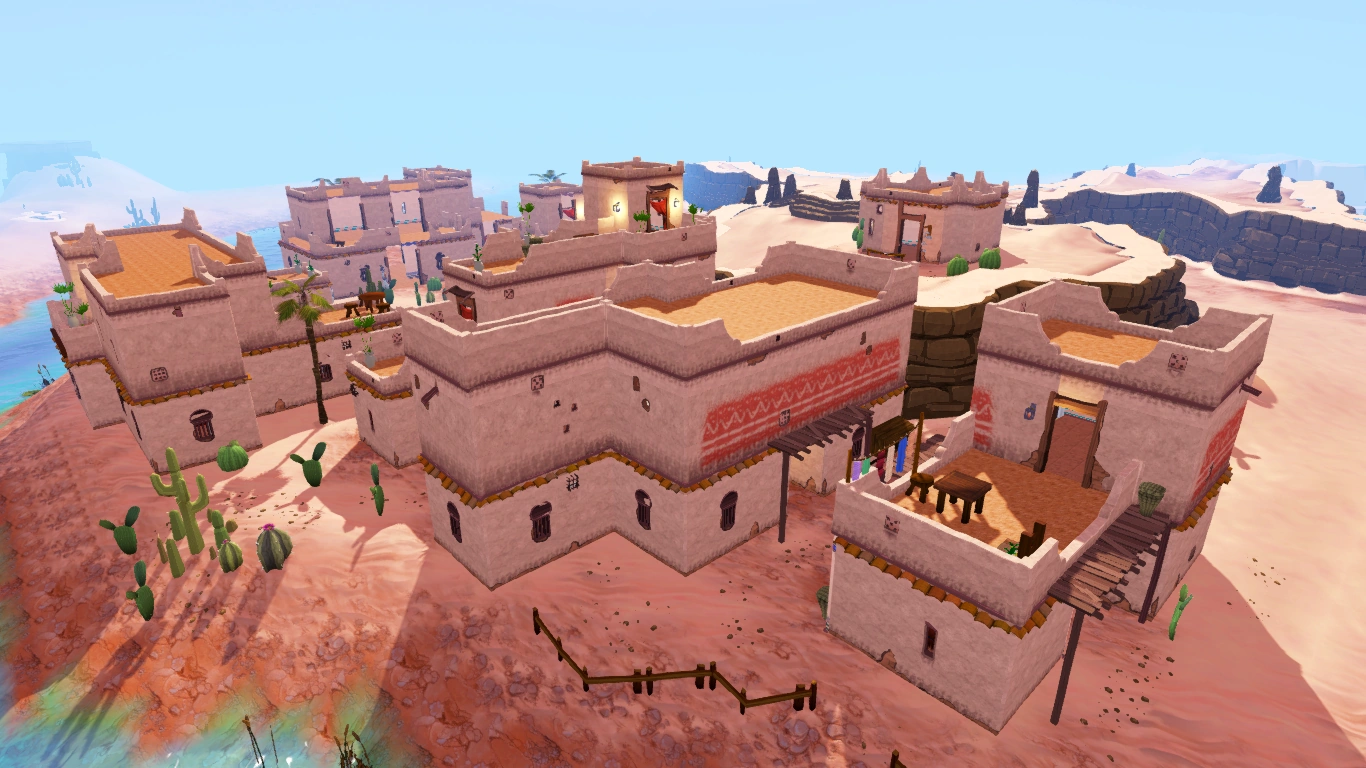
Pollnivneach
Original nomination: Click here.
Reason: This was nominated a while ago. It would definetely be rejected now. Two building are halved due to annoying fog that is everywhere, it's all basically the same colour and like a third of the image is only a roof. It's just a very messy image.
- Support - Our standard has grown from this to become much better. Sentra246 05:35, July 2, 2010 (UTC)
- Support - I think times have changed. The building in the front is chopped off. Lil cloud 9 Talk 07:59, July 2, 2010 (UTC)
- Weak Oppose - The fog is distracting as it is a desert, otherwise nice. Evil1888 Talk A's L 08:45, July 2, 2010 (UTC)
- Oppose - fog in the desert? no, thats dust.... 14:12, July 2, 2010
- Support - Per above supporters. The Last Pun Talk 16:57, July 2, 2010 (UTC)
- Oppose - I think this is a great photo, and it represents Pollniveach so well. It has great aspects of a desert– sand, cacti, not much water. I don't think it matters how much the 'featured image standards' have changed, this was a featured image and should remain because it's a great photo with detailed buildings, etc. Unless someone can shoot an image much better than this for Pollniveach it should stay featured. (Also: So what if the building is cut off...? You know it's a closed building, yet again it's a big structure depicting a great snapshot of a great scenery. CamianaTalk 21:40, July 2, 2010 (UTC)
- Oppose - I dunno, it just doesn't strike me as a great image...
- REDIRECT User:C886553/sig 02:28, July 3, 2010 (UTC)
Neutral - It is a nice looking image when enlarged, but when smaller, the details aren't all that amazing. I'll just be neutral unless a good argument comes up that I support. ~MuzTalk 02:57, July 3, 2010 (UTC)
- Um, I think this is for the wrong picture Lil cloud 9 Talk 04:46, July 9, 2010 (UTC)
- Insanely strong support - This image is awful. This reminds me of the Gu'tanoth image which somehow managed to stay listed... Rhys Talk 03:04, July 5, 2010 (UTC)
- Neutral - Per Evil. Zap0i Talk 15:15, July 6, 2010 (UTC)
- Neutral - I don't think it's terrible but some of the buildings are cut off so I'm really neutral. Shrodder1 16:17, July 8, 2010 (UTC)
- Support - Regardless that it is my own image, looking back at it, it is one the worst of my screenshots. Nephilim Retired 22:37, July 8, 2010 (UTC)
- Notice of intent - Deadline of nomination extended by a week to 16 July 2010. C.ChiamTalk 02:10, July 9, 2010 (UTC)
- Support - Like the Gu'Tanoth one, a lot of the things on it are cut off. It's not striking or amazing at all, besides the detail. xzezerxTalk HS 22:02, July 11, 2010 (UTC)
- Closed - Nomination for delisting is successful. C.ChiamTalk 12:22, July 16, 2010 (UTC)
Fishing guild bank
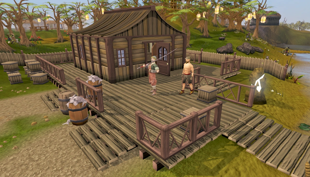
Description: The bank of the fishing Guild, a hotspot for master fishers.
Reason: The colours are dead, its boring to look at. It has three colors, brown, gray, and green. They don't mix very well.
Original nomination:' RuneScape:Featured_images/archive13#Fishing_Guild
- Support - As nom. — Enigma 21:17, July 25, 2010 (UTC)
- Support - Plain, foggy, no center of attention. --Coolnesse 22:24, July 25, 2010 (UTC)
- Oppose - I know that I didn´t fully support it, but I´m starting to like it. Love the open door, leading to the centre of the bank. "What´s inside?" Fswe1 11:31, July 26, 2010 (UTC)
- Strong oppose - Nuez. This is one of the best images on the wiki. bad_fetustalk 11:36, July 26, 2010 (UTC)
- Oppose - It looks great to me. Haven't you heard? Real is brown. Evil1888 Talk A's L 11:57, July 26, 2010 (UTC)
SupportOppose - As I've said, I like asymmetry, and this is a good example of it. The curve of the roof is interesting, and the open door is, for lack of a less old-school word, intriguing. The lack of clear boundaries is nice, though I'd personally like it more if there weren't a summoning obelisk or those white flowers. A slightly lower angle may also be better. Leftiness 06:26, July 27, 2010 (UTC)
- If you like it so much, why do you want to remove it as a featured image? Fswe1 07:11, July 27, 2010 (UTC)
- ... Because I didn't notice that this one was in the nominations for delisting. I was wondering why I saw this in the featured images list a few minutes ago... I guess my reasons for making it featured count as reasons for keeping it featured. Leftiness 04:13, July 28, 2010 (UTC)
- Support removal - That image features a house built with plain wood. It has nothing fancy and nothing special. --LiquidTalk 02:42, July 28, 2010 (UTC)
- Support - Only 3 dead colors, and a lot of fog in the background. Not FIMG worthy if you ask me. Maybe if another shot is taken with a different angle and with a part of the docks on it is taken, it will be better(maybe) JOEYTJE50TALK pull my finger 15:22, July 28, 2010 (UTC)
- Very strong oppose - i love this image ;( 23:56, July 28, 2010 (UTC)
- Oppose - Per Evil. xD. Zap0i Talk 14:55, July 29, 2010 (UTC)
- Support - Per Liquidhelium, Joeytje. User:Haloolah123/Sig 16:11, July 29, 2010 (UTC)
- Support - The colour is rubbish. Shrodder1 17:29, July 29, 2010 (UTC)
- Oppose - I like being just in a natural setting. Its one of the most humble and natural banks in RuneScape. 222 talk 01:49, July 31, 2010 (UTC)
- Notice of intent - Deadline of nomination extended by a week to 8 August 2010. C.ChiamTalk 08:25, August 1, 2010 (UTC)
- Oppose - The fishing guild is a very serene place, and this picture shows it. Lil cloud 9 Talk 11:19, August 2, 2010 (UTC)
- Comment - If this file stays FIMG, the Ghost and the essence mine shoul DEFINETELY be FIMG. JOEYTJE50TALK pull my finger 14:43, August 3, 2010 (UTC)
- This is way better than both tbh. bad_fetustalk 14:23, August 4, 2010 (UTC)
- Oppose - You shouldn't make assumptions about other peoples' opinions. To me, the minimal colours give this image a natural and inviting feel. Riblet15 20:00, August 4, 2010 (UTC)
- Oppose - Per Riblet
- REDIRECT User:LordDarkPhantom/Signature 10:32, August 5, 2010 (UTC)
Spider Queen
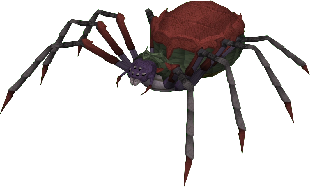
Reason: It has badly applied transparency, it is not appealing and you can see a white outline with a dark theme.
- Support - As nominator.
- REDIRECT User:LordDarkPhantom/Signature 09:29, July 29, 2010 (UTC)
- DID YOU JUST CALL PSYCHO ROBOT's TRANSPARENCY BAD?????!!!!????!!???!?? --Iiii I I I 14:35, July 29, 2010 (UTC)
- Support - Eww. Ugly, and rather disgusting IMHO. bad_fetustalk 09:34, July 29, 2010 (UTC)
Support(thought this was nomination)Oppose - Great angle and interesting. Sentra246 09:36, July 29, 2010 (UTC)
- Support - Per Chess. 222 talk 09:37, July 29, 2010 (UTC)
- Strong oppose - Flattery skillcape pl0x! Fswe1 10:54, July 29, 2010 (UTC)
- Weak oppose - Per all. --Coolnesse 14:31, July 29, 2010 (UTC)
- Weak oppose - Per Cool. Lmao Fswe! Zap0i Talk 14:48, July 29, 2010 (UTC)
- Support - i see like 10 of these in my shed every day...... 16:05, July 29, 2010 (UTC)
- Support - Not amazing...and I've had confessions that it is creeping certain IP address out, who's names (numbers) will remain anonymous. User:Haloolah123/Sig 16:10, July 29, 2010 (UTC)
- Seriously? I mean, I have insect (and spider) phobia too, but this isn't realistic. bad_fetustalk 15:51, July 30, 2010 (UTC)
- LMAO, I was kidding Chess, you just made my day lol! User:Haloolah123/Sig 18:34, August 10, 2010 (UTC)
- Oppose - Per smelly Coelacanth0794 17:55, July 30, 2010 (UTC)
- Oppose - People need to start voting in terms of the picture quality and not whether that object looks cute/ugly. Lil cloud 9 Talk 11:15, August 2, 2010 (UTC)
- Uh.... I certainly don't agree with you. There is absolutely no way I'm supporting a cockroach picture for example, even if it was exactly the same with irl ones. (which would make it even worse.) bad_fetustalk 10:32, August 3, 2010 (UTC)
- By that reasoning, Cockroach_soldier.png should not be a featured image as well. Lil cloud 9 Talk 10:24, August 9, 2010 (UTC)
- By that reasoning, Cockroach_soldier.png should not be a featured image as well.
- I highly doubt having one of the ugliest pictures in our database on the main page is going to appeal to new users. 222 talk 06:22, August 4, 2010 (UTC)
- But I think it has potential to be a cute spider :o Lil cloud 9 Talk 00:14, August 6, 2010 (UTC)
- But I think it has potential to be a cute spider :o
- Support - I don't think this image is up to the standards of other featured images. However on a personal note I don't see how the transparency i did was bad, and no outlines show up on dark colored themes. http://i631.photobucket.com/albums/uu33/Psycho_Robot/Sigs%20and%20Avatars/kitty.pngPsycho Robot talk 06:45, August 4, 2010 (UTC)
- Oppose - Quite simply an awesome picture. Transparency seems fine.Joel amos Talk Contribs 01:49, August 5, 2010 (UTC)
- Notice of intent - Deadline of nomination extended by a week to 12 August 2010. C.ChiamTalk 10:42, August 5, 2010 (UTC)
- Strong support - I don't like this image very much, because it doesn't have the "wow" effect, which FIMGs should have(or they should be just spectacular) Also, the feet look like they aren't on a flat surface(the 3 left(for viewers) front feet look like on a flat surface, then the left back leg looks like a bit higher and the 4 left feet look like 2m higher) and that looks messy, and the image is quite small without AA, which makes the edges look bad. JOEYTJE50TALK pull my finger 17:27, August 7, 2010 (UTC)
- Unbeleavably Strong Oppose - My image. Got it featured. Lyle says no. Bang! BUST MY CHOPS!!! Dockywho • Talk 18:03, August 11, 2010 (UTC)
Underground Pass
Reason: I don't see how this image looks dangerous. The narrow rock path looks rather unrealistic and is so short that the player looks like he could pull himself right back up if he fell. Those rock formations with their tops cut off on either side of the image don't help either. In addition, the spikes look like dead seaweed. It's overall a very dull image that really doesn't give that "whoa" reaction. Although this isn't one of my reasons, I would also like to mention that the exact same player in this image also makes an appearance in another featured image.
Original nomination: RuneScape:Featured_images/archive2#Underground_Pass
- Support - As nominator. Tien 02:23, August 16, 2010 (UTC)
- Support - Per Nominator. User:Haloolah123/Sig 04:54, August 16, 2010 (UTC)
- Oppose - ... I like it. User:Lil diriz 77/Signatures 07:25, August 16, 2010 (UTC)
- Support - Whats so good about it? Sentra246 07:42, August 16, 2010 (UTC)
- Oppose - ^Whats so bad about it? bad_fetustalk 08:39, August 16, 2010 (UTC)
- It's a player walking along a plank with spikes under it, a bit boring, and there nothing really good about. Sentra246 10:19, August 16, 2010 (UTC)
- It's a player walking along a plank with spikes under it, a bit boring, and there nothing really good about.
- Strong Keep (Strong Oppose) - I think the nature of the image is perfect, I love the way the background becomes progressively darker and it highlights the mysteriousness and the morbidity behind the deepest depths of the underground pass. The adventurer is also wearing typical adventurer armour which helps the player understand the purpose of the image. I'm aware the dead seaweed looks slightly weird, but I love this image. Rhys Talk 13:41, August 16, 2010 (UTC)
- Slight support - It has nice detail, but too dark and dead. JOEYTJE50TALK pull my finger 14:43, August 16, 2010 (UTC)
- strong support - 5 colors, stupid and fake looking spikes, path would be impossible to fall off of. 3rd age farcaster 17:20, August 16, 2010 (UTC)
- Oppose - The fog and dull and dark colours that would usually make me support this image for delisting, give an adventurous feeling to this image. It makes you think: "Where the heck am I?! Rescue me!" Fswe1 18:48, August 16, 2010 (UTC)
- He could just teleport instead of standing there and wasting time to get rescued. Murd3rlogistTalk• Contribs • Sign here 14:37, August 17, 2010 (UTC)
- He was talking about what it looks like. Not what to do in such situations. JOEYTJE50TALK pull my finger 16:19, August 17, 2010 (UTC)
- He was joking.
- He was talking about what it looks like. Not what to do in such situations. JOEYTJE50TALK pull my finger 16:19, August 17, 2010 (UTC)
- REDIRECT User:LordDarkPhantom/Signature 13:51, August 18, 2010 (UTC)
- We know. --Coolnesse 17:33, August 18, 2010 (UTC)
- COCONUT!!! Fswe1 18:46, August 18, 2010 (UTC)
- Joey doesn't know according to his reply, seems too serious
- Joey doesn't know according to his reply, seems too serious
- COCONUT!!!
- We know. --Coolnesse 17:33, August 18, 2010 (UTC)
- REDIRECT User:LordDarkPhantom/Signature 10:53, August 19, 2010 (UTC)
- Oppose - Per Gradius/Fswe. --Coolnesse 17:20, August 17, 2010 (UTC)
- Support - Per nominator. --LiquidTalk 18:02, August 18, 2010 (UTC)
- Support - Per nom.
- REDIRECT User:-Matt/sig 07:09, August 19, 2010 (UTC)
- Support Z..z...z...z...z Twig Talk https://i.imgur.com/772kZGs.png 07:15, August 19, 2010 (UTC)
- Support - =/ Zap0i Talk 02:28, August 20, 2010 (UTC)
- Support - Per all. It looks like the set of a really cheap movie. 222 talk 07:21, August 20, 2010 (UTC)
- Closed - Image will be delisted. --LiquidTalk 01:09, August 23, 2010 (UTC)
File:Runecraft cape (t) equipped.png
_equipped.png)

Reason - It's just a cape. It doesn't have the wow-effect, has some background under arm.
Original nomination - RuneScape:Featured images/archive8#Runecraft cape
- Support - As nom JOEYTJE50TALK pull my finger 23:35, September 8, 2010 (UTC)
- Strong support - I never liked it, and never really thought it should have been featured. Skillcapes are so ubiquitous nowadays that it's not worthwhile to feature one of them. --LiquidTalk 23:36, September 8, 2010 (UTC)
- Support - In the era of oculus, this type of image is no longer significant. http://i631.photobucket.com/albums/uu33/Psycho_Robot/Sigs%20and%20Avatars/kitty.pngPsycho Robot talk 23:39, September 8, 2010 (UTC)
- Support-ish - No pizazz, but but sort of nice. Evil1888 Talk A's L 23:41, September 8, 2010 (UTC)
- Support - What is this I don't even. --Coolnesse 23:42, September 8, 2010 (UTC)
- Replace - with a better angle. Its a good pic, but the hair on her, the gloves, and the angle don't look good. Still better then 90% of the scenery images though. 3rd age farcaster 00:10, September 9, 2010 (UTC)
- The angle is not getting any better i think, and look at the poll on the top of the RS:FIMG page, and you see that current scenery is liked so much that people want more of them being a featured image. JOEYTJE50TALK pull my finger 08:56, September 9, 2010 (UTC)
- Support - I was planning on nominating this. While it was nice in 2009, there's really nothing to it now. ʞooɔ 08:59, September 9, 2010 (UTC)
- Agreed. It was originally actually featured because it would be the only item image featured.This is now different, so this image should be delisted. JOEYTJE50TALK pull my finger 19:20, September 9, 2010 (UTC)
- Strong support - Per above.
- REDIRECT User:-Matt/sig 09:07, September 9, 2010 (UTC)
- Support - How the hell is this a featured image, it's like any other skill cape pic. Sentra246 09:08, September 9, 2010 (UTC)
- Strong support - Per helm. 222 talk 11:12, September 10, 2010 (UTC)
- Slight support - Not unappealing in the least, but it doesn't stand out compared to countless other images on the wiki =/. Zap0i Talk 03:31, September 11, 2010 (UTC)
- Support - It looks good, but... (per everybody) Fswe1 05:21, September 11, 2010 (UTC)
- Exept some guy i dont like... JOEYTJE50TALK pull my finger 20:54, September 15, 2010 (UTC)
- STRONGLY support - True... the left arm is showing on the background. |0ComeKillLah, Meh|Talk to me!| 09:44, September 11, 2010 (UTC)
- Support - Someone amputated her right arm. Murd3rlogistTalk• Contribs • Sign here 13:18, September 12, 2010 (UTC)
- Delist - Well the rcing symbol looks nice, but there's really nothing special here. User:Haloolah123/Sig 18:19, September 14, 2010 (UTC)
- Oppose/Replace -It's a nice image, with nice detail, although it could be bigger. bad_fetustalk 14:59, September 15, 2010 (UTC)
- And if someone else would have nominated it for delisting, what would you have said? really, i don't understand you. Is this ugly thing really better than golden trimmed dragon armor? really...{{fool}} You really have a different opinion than almost all other wikia contributors. You are the only one opposing the delisting of this crap. Also, you are, together with some sentra guy, the only one who wants to keep crappy speculation pages. Maybe you should think of changing some things, because you are kinda the oppose of the regular wikia contributor. also, don't you see something spastic about the hand? i think you did, as you watch the details of images for bad things often, but you didn't talk about it bcus u wanna b a pain in the neck for me. JOEYTJE50TALK pull my finger 20:54, September 15, 2010 (UTC)
- Don't reply to this. http://i631.photobucket.com/albums/uu33/Psycho_Robot/Sigs%20and%20Avatars/kitty.pngPsycho Robot talk 20:57, September 15, 2010 (UTC)
- Don't reply to this. http://i631.photobucket.com/albums/uu33/Psycho_Robot/Sigs%20and%20Avatars/kitty.pngPsycho Robot talk
Ape Atoll Agility Course
Reason: The waterfalls are ugly and have too much of a block feeling. Wooden structure has no shadow. Bad angel; too high up. Center of picture is jammed together.
Original nomination - RuneScape:Featured images/archive6#Ape Atoll Agility Course(2)
- Support - As nominator. Joel amos Talk Contribs 10:26, October 5, 2010 (UTC)
- Neutral - I hate the way waterfalls look, but the rest of the image is great. bad_fetustalk 13:13, October 5, 2010 (UTC)
- Support - I love the waterfalls, I hate the rest. In other words: Standards have risen. Fswe1 17:22, October 5, 2010 (UTC)
- Strong oppose - One of the best images on the wiki. --Coolnesse 19:33, October 5, 2010 (UTC)
- Support - Very bad angle, the shadows are very messy and the sides are cut off at a bad spot. JOEYTJE50TALK pull my finger 20:06, October 5, 2010 (UTC)
- Weak Support - Due to the lack of detail on the grass, water, dirt, etc. Mr. Anura 20:07, October 5, 2010 (UTC)
- Oppose - I kinda like it. Suppa chuppa Talk 20:12, October 5, 2010 (UTC)
- Support - The angle of this image makes it lose perspective entirely. Onuasdad 23:57, October 5, 2010 (UTC)
- Strong support - The waterfalls are just blocks of gradient with white peanuts at their bases. The wooden platforms and ladders seem to be floating above the tree, but they also seem to be on the ground because of the lack of shadows (even though the trees have shadows). As mentioned above, this is probably due to the angle of the image. Tien 00:46, October 6, 2010 (UTC)
- Support - The angle isn't too great and the waterfalls are hideous. The Last Pun Talk 01:26, October 6, 2010 (UTC)
- Neutral - It's very well detailed, but i'm not sure because of the waterfalls. Sentra246 05:02, October 6, 2010 (UTC)
- Strong oppose - I like this image muchly. User:LordDarkPhantom/Signature 17:35, October 7, 2010 (UTC)
- Strong support - Horrible angle and waterfalls. Zap0i Talk 01:29, October 8, 2010 (UTC)
- Strong support - The image itself makes me feel weird with its graphical errors and mistakes, if this were "realer" it would make me feel sick. 222 talk 23:41, October 8, 2010 (UTC)
- The strongest of strongs that have ever stronged the strong support - Why the hell did this image get featured?! It sucks! It's majorly dull and you can barely see the guy. One word for whoever made this: ZOOM.
- REDIRECT User:-Matt/sig 01:42, October 9, 2010 (UTC)
- That is a guy right? O_o
- REDIRECT User:-Matt/sig 01:43, October 9, 2010 (UTC)
Fishing Guild
Reason - OH MY...! This is one of the worst pics i have ever seen. Ok, this is what I don't like about it: Not with AA, quite small, terrible fog, visually very noisy, the guy in dragon chain in the back looks like jumping in the water, bench next to him has almost completely disappeared, guy with poison in the front, man in the front is walking, fishing items half disappear at some ppl, cut off some people at the right, "Eep"ing duck(ling) in the back, (they all wear noob armor), do i have to add more reasons?
Original nominations: RuneScape:Featured images/archive1#Fishing_Guild; RuneScape:Featured images/archive-delisting#Fishing Guild
- Extreme strong support, extremer than i have never extremed before - As nom JOEYTJE50TALK pull my finger 20:23, October 5, 2010 (UTC)
- Btw, my eyes hurt... JOEYTJE50TALK pull my finger 20:24, October 5, 2010 (UTC)
- Support - Its not that bad Joey, but compaired with other featured images, yea it should be delisted. Mr. Anura 20:28, October 5, 2010 (UTC)
- Just making my point... JOEYTJE50TALK pull my finger 20:52, October 5, 2010 (UTC)
- Support - Away with it. --Aburnett (Talk) 20:39, October 5, 2010 (UTC)
- Comment to admins - Please also revert the image to the other version of guild.png mrt 23, 2010 17:13 by FisherDavve when you close this. Click guild.png&action=revert&oldimage=20100323173644!Fishing guild.png&wpEditToken=49758a19347eed8b9a9f1ef386c55add%2B\ here to do that AFTER the nomination. To other users: Please don't revert this as it is not allowed to change featured images. JOEYTJE50TALK pull my finger 20:56, October 5, 2010 (UTC)
Retake - It can obviously be improved, what with the new graphics for the Fishing Guild and all. ![]() Coelacanth0794 Talk
Coelacanth0794 Talk ![]() 20:58, October 5, 2010 (UTC)
20:58, October 5, 2010 (UTC)
- As this is a nom for removing, and you suggest retaking, i assume you Oppose this staying fimg for now? JOEYTJE50TALK pull my finger 22:39, October 9, 2010 (UTC)
- Oppose - --Coolnesse 22:14, October 5, 2010 (UTC)
- Oppose - This nomination should not have been a delisting as the area has great potential for a great picture. I suggest someone takes a larger resolution, max-AA, great angle picture and we move this nomination to a replacement. 222 talk 22:17, October 5, 2010 (UTC)
- Strong support - How did this pass in the first place anyways? The fog behind is terrible, it's full of players, and of them actually is taking damage. How is that a nice image? bad_fetustalk 06:12, October 6, 2010 (UTC)
- This passed because it looked like people doing their buisness, because it was one of their favorite places, because they wanted scenery and they didn't want things with transparency. Of course, standards have risen in the 5,510 days that passed, so this image should be delisted imo JOEYTJE50TALK pull my finger 09:20, October 6, 2010 (UTC)
- Strong oppose - I love this image because it's so lively. Fishing, brightness, colours, water, poison, Ibis, etc. Fswe1 12:41, October 6, 2010 (UTC)
- ...People with dragon chains committing suicide... JOEYTJE50TALK pull my finger 13:58, October 6, 2010 (UTC)
- I don't see anyone with a dragon chainbody committing suicide. --Iiii I I I 15:53, October 9, 2010 (UTC)
- Look at the guy the far back of the image, he looks like he's about to jump in the water... JOEYTJE50TALK pull my finger 13:04, October 10, 2010 (UTC)
- I see him now. >.< --Iiii I I I 00:21, October 12, 2010 (UTC)
- Look at the guy the far back of the image, he looks like he's about to jump in the water... JOEYTJE50TALK pull my finger 13:04, October 10, 2010 (UTC)
- I don't see anyone with a dragon chainbody committing suicide. --Iiii I I I 15:53, October 9, 2010 (UTC)
- Support - Because of the poison hitsplat.
@ Joey: Please don't respond to everyone liek you did to Fswe, they have their own opinions and what you are doing isn't very nice, even though you aren't doing it for bad purposes. It seems you constantly patrol the RS:FI... User:LordDarkPhantom/Signature 17:42, October 7, 2010 (UTC)
- That's because i like images, and also i like discussing them, but i'll try not to respond to everyone... Oops now i respond another user again... JOEYTJE50TALK pull my finger 21:51, October 7, 2010 (UTC)
- Lol User:LordDarkPhantom/Signature 20:15, October 14, 2010 (UTC)
- Lol
- Support - I dislike it, but it's kind of has a "RuneScape feeling" o_O. Zap0i Talk 01:35, October 8, 2010 (UTC)
- Support - This image sucks. It's really dull. It's just people fishing, and that guy taking poison damage?!
- REDIRECT User:-Matt/sig 01:32, October 9, 2010 (UTC)
- Retake per Coelacanth. --Iiii I I I 15:53, October 9, 2010 (UTC)
- As this is a nom for removing, and you suggest retaking, i assume you Oppose this staying fimg for now? JOEYTJE50TALK pull my finger 22:39, October 9, 2010 (UTC)
- I believe that the better line of action would be keeping it as FIMG and then nominating a new image as it replacement when it is retaken. 222 talk 23:11, October 9, 2010 (UTC)
- It actually is neither. It doesn't support removing it from fimg, and it doesn't support keeping it as a fimg in this version. bad_fetustalk 12:08, October 10, 2010 (UTC)
- Just saying... this is a nom for delisting, not for retaking JOEYTJE50TALK pull my finger 13:04, October 10, 2010 (UTC)
- That doesn't mean that you can't state it's a better idea to retake it. bad_fetustalk 13:05, October 10, 2010 (UTC)
- Oppose delisting, then... --Iiii I I I 14:12, October 10, 2010 (UTC)
- Ok, i just said to be clear, and i thought you would support because you want the image to be improved, and i thought only top quality images are FIMG. Apparently you think images that need improvement deserve to be FIMG too. No problem, i respect ur opinion, just think it's strange. JOEYTJE50TALK pull my finger 14:21, October 10, 2010 (UTC)
- Any image can be improved, nothing is perfect. bad_fetustalk 14:32, October 10, 2010 (UTC)
- ye, but if you support retake, it is not top quality to you, as you don't support retaking a top image. And i thought fimgs are top quality only... JOEYTJE50TALK pull my finger 20:32, October 10, 2010 (UTC)
- You want replacement? here you have it. JOEYTJE50TALK pull my finger 21:56, October 10, 2010 (UTC)
- ye, but if you support retake, it is not top quality to you, as you don't support retaking a top image. And i thought fimgs are top quality only... JOEYTJE50TALK pull my finger 20:32, October 10, 2010 (UTC)
- Any image can be improved, nothing is perfect. bad_fetustalk 14:32, October 10, 2010 (UTC)
- Ok, i just said to be clear, and i thought you would support because you want the image to be improved, and i thought only top quality images are FIMG. Apparently you think images that need improvement deserve to be FIMG too. No problem, i respect ur opinion, just think it's strange. JOEYTJE50TALK pull my finger 14:21, October 10, 2010 (UTC)
- Oppose delisting, then... --Iiii I I I 14:12, October 10, 2010 (UTC)
- That doesn't mean that you can't state it's a better idea to retake it. bad_fetustalk 13:05, October 10, 2010 (UTC)
- Just saying... this is a nom for delisting, not for retaking JOEYTJE50TALK pull my finger 13:04, October 10, 2010 (UTC)
- Strong Support - Climb back into the wretched scythe-hole you emerged from, you concave cretin. 14:27, October 10, 2010 (UTC)
- Strong support - The mass of players standing around is horrid. --LiquidTalk 14:35, October 10, 2010 (UTC)
- Closed - Image has been successfully delisted. Tien 19:09, October 15, 2010 (UTC)
File:Courtroom.png
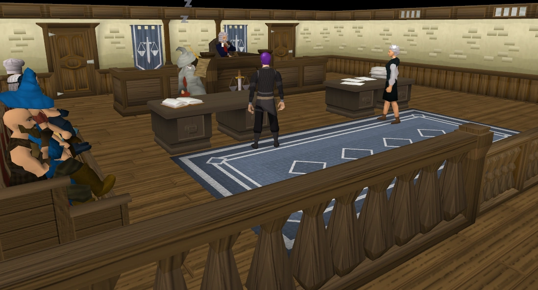
Reason - Boring, all facing back to camera, only half AA, either unibraw, or glitch in judge's eyebraw. I did experience the wow factor when i saw it: "Wow... This kind of images are also featured..."
Original nomination - RuneScape:Featured images/File:Courtroom.png
- Strong support - Lolz, this thing made it till fimg... JOEYTJE50TALK pull my finger 22:26, September 30, 2010 (UTC)
- Strong support - I love your reason, especially the wow factor part. --LiquidTalk 22:29, September 30, 2010 (UTC)
- Strong oppose - (since you strong'd, I'll strong http://i.imgur.com/eCopM0F.png) I don't have the slighted idea what you mean by "half AA", I had it on 4x AA, It shows how you see a courtroom (save for the judge, bailiff, and person on the stand), it makes you look as if you are in the audience and not from a cameraman's view like on TV. Evil1888 Talk A's L 22:34, September 30, 2010 (UTC)
- U might have had the AA on 4x, but sometimes there happens something strange with rs, which puts 4xAA on 2xAA, like i experienced at File:Imp GWD.png if you look carefully. This is however no excuse to make the image look better, and it still looks exactly the same. JOEYTJE50TALK pull my finger 15:12, October 1, 2010 (UTC)
- Oppose - It looks fine to me. If you really see so many flaws with it, take a better one nominate it for replacement. 222 talk 06:12, October 2, 2010 (UTC)
- Strong oppose - Certainly one of the best images on the wiki, if not the best. bad_fetustalk 07:21, October 2, 2010 (UTC)
- Weak oppose - Per Chess. --Coolnesse 10:34, October 2, 2010 (UTC)
- Neutral - I don't like it. I don't hate it either. Fswe1 14:04, October 3, 2010 (UTC)
- Support - Ugly image. User:Haloolah123/Sig 16:31, October 4, 2010 (UTC)
- Strong oppose - Per 222. Lil cloud 9 Talk 22:48, October 4, 2010 (UTC)
- Strong support - This picture is seen too much. It was on the RS homepage for a long time, and panoramas of the courthouse are seen very frequently during Court Cases. Onuasdad 00:00, October 6, 2010 (UTC)
- Oppose - A bit empty, but the rest is pretty good. Zap0i Talk 01:31, October 8, 2010 (UTC)
- The weakest of all weaknesses that are weak support - I get why this image would be nom'ed for fimg, but it's kinda dull and boring. Perhaps a better angle?
- REDIRECT User:-Matt/sig 01:39, October 9, 2010 (UTC)
- Extended for a week until 16 October 2010. --Iiii I I I 15:41, October 9, 2010 (UTC)
- Strong support - LOL, Jagex took this image. They also used it as their news-image when they released Court Cases (Batch 1 or 2, I can't remember, but I don't care either). That is a no-no. User:Lil diriz 77/Signatures 02:41, October 13, 2010 (UTC)
- I might be wrong, but if I didn't mix this with something else, the image was not the same, but very similar. (Now, since I doubt something similar happened with another image, I doubt I'm wrong.) bad_fetustalk 18:01, October 15, 2010 (UTC)
[[:File:Cockroach soldier in habitat.png]]
[[File:Cockroach soldier in habitat.png|250px|right]]
Reason - "Boring, Small image, and no wow effect"
Original nomination - RuneScape:Featured_images/archive3#Cockroach_soldier
- Strong support - As nominator. Dead evil84 Talk[Myface] 13:45, September 30, 2010 (UTC)
- Strong support - I was gonna nom it, but I kept forgetting, anyways, first of all it's small, and undetailed. Second, the main reason I wanted it delisted, it freaks me out. I don't want to see a disgusting cockroach on the mainpage. (Yes, I also freak out when I see roaches irl. They are disgusting.) bad_fetustalk 13:51, October 15, 2010 (UTC)
- Support - Was gonna nom a replacement for this, but forgot a while ago. --Coolnesse 14:13, October 15, 2010 (UTC)
- Strong support - This is absolutely disgusting. If it was just a roach, it wouldn't be that bad. But, you're adding in all that yucky green goo in the background. This is certainly not the type of image that we want featured. --LiquidTalk 14:13, October 15, 2010 (UTC)
- Support - Despite the fact that I really like cockroaches (I even had a pet one once), this image humiliates my roachy buddies. It's not good at all. Fswe1 15:30, October 15, 2010 (UTC)
- You serious? Remind me not to touch you if I ever see you irl D: bad_fetustalk 15:40, October 15, 2010 (UTC)
- Insects freak me out, though this one looks cool. User:LordDarkPhantom/Signature 19:09, October 15, 2010 (UTC)
- Strong oppose - Good background and nice stance. User:LordDarkPhantom/Signature 19:09, October 15, 2010 (UTC)
- Support - Eeeeek!!! it's an ugly image! JOEYTJE50TALK pull my finger 20:57, October 15, 2010 (UTC)
- Shouldn't this image be speedy deleted because it has no use, and does not add to the article? there is already the trans'd image, and the background is no addition. I think the thing should be speedy deleted if this delist nom passes. JOEYTJE50TALK pull my finger 23:44, October 15, 2010 (UTC)
- Support - Per nom.
- REDIRECT User:-Matt/sig 00:35, October 16, 2010 (UTC)
- Support - Per Chess. I don't think it needs to be deleted though... Zap0i Talk 02:43, October 16, 2010 (UTC)
- (ha)waii not? bout evry1 supports, and the opposer does not have a phenomenal reasons that beats all other reasons... JOEYTJE50TALK pull my finger 16:44, October 16, 2010 (UTC)
- ...The fact is, just because it is (probably) not an FI anymore, it doesn't mean that it cannot stay in the article. However I agree with you there, it doesn't have a good enough reason to remain. User:LordDarkPhantom/Signature 08:45, October 17, 2010 (UTC)
- Support - The only thing remotely attention-grabbing about this image is the lighting, and even that isn't too great. Otherwise, it's just a picture of a bug. Tien 03:34, October 17, 2010 (UTC)
- Strong support - It's a non-transparent bug. 222 talk 03:36, October 17, 2010 (UTC)
- Support - How is that even a FIMG, it's small, quite boring, the only good bit is the kinda fluro green. Sentra246 09:02, October 17, 2010 (UTC)
- Bcus the lighting detail thingy was new then, and they liked the greenishness. JOEYTJE50TALK pull my finger 10:26, October 17, 2010 (UTC)
- Support - Not featured image worthy. JudytjetalkMyface 20:02, October 17, 2010 (UTC)
- Closed - Image will be delisted. --LiquidTalk 00:48, October 22, 2010 (UTC)
Trollweiss Mountain
Reason: small, no "Wow" effect, player looks silly, "not all that good"(like halo would say). This was a nice image at the time of nominating, but now the standard quality has risen, and this is a regular quality image. Not very good, but not very bad either.
Original nomination - RuneScape:Featured images/archive2#Trollweiss Mountain Valley (2)
- Support - As nominator.(yes, there are alot of delist noms these days. It looks like a cleanup of fimgs ) JOEYTJE50TALK pull my finger 16:40, October 17, 2010 (UTC)
- Weak support - Actually, the area is great but the player sort of ruins it. bad_fetustalk 16:42, October 17, 2010 (UTC)
- Support - Not impressive in any way, except for the snow. --LiquidTalk 16:43, October 17, 2010 (UTC)
- Support - WTF why is the player sliding up the hill? --Coolnesse 18:03, October 17, 2010 (UTC)
- Is he? The image is so unclear i can see if he does.. JOEYTJE50TALK pull my finger 18:16, October 17, 2010 (UTC)
- Oppose - Fog makes it more snowy, nice fade out. It's just a nice image. JudytjetalkMyface 20:05, October 17, 2010 (UTC)
- Support - Sorry, but this image looks to fake. The snow looks fake, the trees are all the same shape and the flowers - don't get me started. And it completely defies the laws of physics too! Sliding up a hill... 222 talk 05:47, October 18, 2010 (UTC)
- Support - Per nominator and above. Zap0i Talk 14:33, October 18, 2010 (UTC)
- Support - Very boring, a player on a slay on some white stuff. Sentra246 05:51, October 20, 2010 (UTC)
- I assume you mean sled when you say "slay"? JOEYTJE50TALK pull my finger 11:00, October 20, 2010 (UTC)
- More likely a sleigh User:LordDarkPhantom/Signature 22:29, October 20, 2010 (UTC)
- Well, the item is called sled in runescape...{{fool}} JOEYTJE50TALK pull my finger 20:56, October 21, 2010 (UTC)
- Irrelevant, he was referring to a real-life item called sleigh (which is a sled) {{fool}} User:LordDarkPhantom/Signature 14:06, October 23, 2010 (UTC)
- He was referring to the thing he is sitting on which is a sled[sic]{{fool}}{{fool}}{{fool}}{{fool}}{{fool}} JOEYTJE50TALK pull my finger 23:21, October 23, 2010 (UTC)
- Sled and sleigh are the same thing {{fool}} Say them out loud to yourself and tell me which sounds more like "slay". Gf. {{fool}} User:LordDarkPhantom/Signature 09:06, October 25, 2010 (UTC)
- He was referring to the thing he is sitting on which is a sled[sic]{{fool}}{{fool}}{{fool}}{{fool}}{{fool}} JOEYTJE50TALK pull my finger 23:21, October 23, 2010 (UTC)
- Irrelevant, he was referring to a real-life item called sleigh (which is a sled) {{fool}} User:LordDarkPhantom/Signature 14:06, October 23, 2010 (UTC)
- Well, the item is called sled in runescape...{{fool}} JOEYTJE50TALK pull my finger 20:56, October 21, 2010 (UTC)
- More likely a sleigh
| “ | "Sledge" and "Sleigh" redirect here. | ” |
— Wikipedia
|
- And on what page is that^^? Sled. Gf indeed. JOEYTJE50TALK pull my finger 22:18, October 28, 2010 (UTC)
- Take it to the talk page guys. Sentra246 08:18, October 29, 2010 (UTC)
- Take it to the talk page guys.
- And on what page is that^^? Sled. Gf indeed. JOEYTJE50TALK pull my finger 22:18, October 28, 2010 (UTC)
- Ok guys i know it is sledge in normal english so let me correct myself:
- I assume you mean sled[sic] when you say "slay"?
- It is directly copied from the original name. And as sentra said "a player on a slay" he probably meant to say a player on (thing it is sitting on) and as there are no sledges in runescape, but only sleds, he probably meant a sled JOEYTJE50TALK pull my finger 14:00, October 23, 2010 (UTC)
- Oppose - I like the picture, it makes me feel all happy inside knowing that we've learned not only how gravity works, but how to break it as well. User:TyA/sig 23:35, October 23, 2010 (UTC)
- Oppose - add new 'Holiday' Images - The idea is simple winter type scenes for winter (Jagex HQ winter, nothing against Aussie winters mind you, just following protocol, since the game is based in...) So this image wouldn't be year round only say in the month of December and or January (or whenever winter is at Jagex HQ). let's do this. User:Kytti khat/sig 02:16, October 24, 2010 (UTC)
- Notice of intent - Nomination extended until October 31, 2010. --LiquidTalk 03:01, October 24, 2010 (UTC)
- Wut? 8 supporters and 3 opposers needs extention? and i can't really say the reasons the opposers gave outweigh the reasons the supporters gave... Could some other admin plz close this because extention is not needed here? I think liquid just extended because he liked the image... JOEYTJE50TALK pull my finger 17:12, October 28, 2010 (UTC)
- Oh and i know we don't count votes, but the supporters just got better reasons than the opposers imo, so i...
- JOEYTJE50TALK pull my finger 17:17, October 28, 2010 (UTC)
- First of all, I supported delisting, meaning that I don't like the image. Second of all, what you're doing is in violation of the consensus policy. Third of all, I do not believe that there is sufficient consensus to delist it right now, despite my personal preference for delisting. --LiquidTalk 22:00, October 28, 2010 (UTC)
- First: Oh, didn't see Second: Why? I am just saying "the supporters just got better reasons than the opposers imo" and consensus is about reasons isn't it? JOEYTJE50TALK pull my finger 22:18, October 28, 2010 (UTC)
- You asked for another sysop to come and reverse my decision. Once a decision has been made, RS:CONSENSUS says that you can't go and keep asking people until you get a favorable decision. --LiquidTalk
- Ok, i didn't know, sry. But still i'd like to know, what made you think this should be extended? Do you think the reasons the opposers gave are better/as good as the reasons the supporters gave? JOEYTJE50TALK pull my finger 16:59, October 30, 2010 (UTC)
- You asked for another sysop to come and reverse my decision. Once a decision has been made, RS:CONSENSUS says that you can't go and keep asking people until you get a favorable decision. --LiquidTalk
- First: Oh, didn't see
- I didn't think that the consensus was that great to close it right then and there to delist, so I decided to extend it to try and get fresh opinions. --LiquidTalk 19:05, October 30, 2010 (UTC)
- First of all, I supported delisting, meaning that I don't like the image. Second of all, what you're doing is in violation of the consensus policy. Third of all, I do not believe that there is sufficient consensus to delist it right now, despite my personal preference for delisting. --LiquidTalk 22:00, October 28, 2010 (UTC)
- JOEYTJE50TALK pull my finger 17:17, October 28, 2010 (UTC)
Support - Oh wow! This image is sooooooo cool! I'm gonna hang on the wall and make a shrine to it!
- REDIRECT User:-Matt/sig 02:08, October 31, 2010 (UTC)
- Oh right. It's dull and teeny-tiny.
- REDIRECT User:-Matt/sig 02:09, October 31, 2010 (UTC)
Oppose - It's good scenery. ![]() Lil cloud 9 Talk 11:42, November 1, 2010 (UTC)
Lil cloud 9 Talk 11:42, November 1, 2010 (UTC)
Closed - ![]() Image will be delisted. --LiquidTalk 12:30, November 1, 2010 (UTC)
Image will be delisted. --LiquidTalk 12:30, November 1, 2010 (UTC)
Ancient Cavern
Reason: Quite dull, not very balanced, and aspects of the image are out of date.
Original nomination - RuneScape:Featured_images/archive2#Ancient Cavern
- Support - As nom. It's my first featured image related thing as well . 222 talk 10:31, October 19, 2010 (UTC)
- Oppose - That's the best image evar. Seriously though, I don't see why anyone would delist that. bad_fetustalk 13:23, October 19, 2010 (UTC)
- Oppose/Retake - Nice flow in the ground, nice detail and lighting, just awesome image. The only thing is the obsolete dragon, but it is not notable enough to delist imo. JOEYTJE50TALK pull my finger 14:08, October 19, 2010 (UTC)
- Support - The landscape is cool but the player there and some of the monsters take away from the pic, also if there weren't any of them it would be to boring. Sentra246 06:00, October 20, 2010 (UTC)
- 'Neutral - The Fiends and Dragons look very cool, but that player's back and cut-off fake water is crap. Fswe1 07:59, October 23, 2010 (UTC)
- Neutral - Per above. Zap0i Talk 23:53, October 23, 2010 (UTC)
- Support - Obsolete dragon ftl. --クールネシトーク 11:49, October 24, 2010 (UTC)
- Notice of intent - Deadline of nomination extended by a week to 2 November 2010. C.ChiamTalk 07:07, October 26, 2010 (UTC)
- Support - Per nom.
- REDIRECT User:-Matt/sig 02:11, October 31, 2010 (UTC)
- Support - It's not impressive. --LiquidTalk 00:57, November 2, 2010 (UTC)
- Closed - No consensus. --LiquidTalk 00:57, November 2, 2010 (UTC)
Aviansie
Reason: Not up to the standards of other images.
Original nomination: RuneScape:Featured images/File:AviansieHD.png
- Support - as nominator User:LordDarkPhantom/Signature 20:38, October 14, 2010 (UTC)
- Strong oppose - No it's not. --Coolnesse 20:59, October 14, 2010 (UTC)
- Stronger oppose - This image rules. Period. Coelacanth0794 Talk 21:01, October 14, 2010 (UTC)
- Neutral - Something is wrong with his right leg. Dead evil84 Talk[Myface] 06:33, October 15, 2010 (UTC)
- Neuteal - I don't know. Perhaps bodyguards are more impressive? Fswe1 17:53, October 15, 2010 (UTC)
- Strong support - It looked way better before, except that it's colors were inaccurate which meant we shouldn't have it on the wiki. Anyways, this isn't fimg material. bad_fetustalk 17:59, October 15, 2010 (UTC)
- Neutral leaning to oppose - Nice detailed image, but not very good
angelangle. Still looks very nice though. JOEYTJE50TALK pull my finger 21:48, October 15, 2010 (UTC) - Strong support - Never liked it in the first place. 222 talk 00:33, October 16, 2010 (UTC)
- Support - Aviansies aren't that color, are they? --LiquidTalk 00:35, October 16, 2010 (UTC)
- They come in different designs, however I did not see the previous version in GWD. User:LordDarkPhantom/Signature 08:29, October 16, 2010 (UTC)
- Neutral + Comment - I don't like the picture that much, but it's not bad. And I believe the reason the former image was replaced was because the colour wasn't accurate. Zap0i Talk 02:40, October 16, 2010 (UTC)
- Yes, I think that played an important factor. User:LordDarkPhantom/Signature 08:29, October 16, 2010 (UTC)
- Neutral - Ugly black thing at the back, but the rest is nice. JudytjetalkMyface 19:59, October 17, 2010 (UTC)
- Support - A bit boring. Sentra246 05:49, October 20, 2010 (UTC)
- Notice of intent - Nomination extended for a week until October 28, 2010. --LiquidTalk 23:26, October 21, 2010 (UTC)
- Notice of intent - Deadline of nomination extended by a week to 4 November 2010. C.ChiamTalk 12:55, October 28, 2010 (UTC)
- Support - No "wow" factor in my opinion.
- REDIRECT User:-Matt/sig 02:13, October 31, 2010 (UTC)
Brimhaven dungeon

Reason: Because there were quite some people who voted "delist" on the nomination for replacement, i am now officially going to nominate it for that. I think it should be delisted because:
It is boring, and has a player with a too dark cape in the center. Also, it has quite pale colors.
- Support - As nominator. JOEYTJE50TALK pull my finger 07:55, November 2, 2010 (UTC)
- Support - Very boring and plain. 222 talk 08:09, November 2, 2010 (UTC)
- Support - It should have been delisted already in the first place, the replacement nomination's consensus was delisting >_> bad_fetustalk 14:04, November 2, 2010 (UTC)
- That's y i nommed it again... JOEYTJE50TALK pull my finger 14:42, November 3, 2010 (UTC)
- Support - It's pretty dull and boring, with no WOW factor. Also, the lighting does not seem to be right. User:LordDarkPhantom/Signature 13:50, November 5, 2010 (UTC)
- Weak support - It's one of those images that looks impressive (symmetry, pillars of fire) at first glance, but then loses its grandeur when you take a closer look at it. Tien 23:33, November 5, 2010 (UTC)
- Support - Per all. Zap0i Talk 00:40, November 6, 2010 (UTC)
- Support - Per above. Not too impressive. Suppa chuppa Talk 00:49, November 6, 2010 (UTC)
- Support - Hey, Mr. Skillcape. I don't think you should continue. If you find the stairs so awesome, you might get a heart attack after seeing a dog. Or fungi... Fswe1 07:41, November 6, 2010 (UTC)
Jaldraocht Pyramid
Reason: just 1 color, which is also a very boring color. It is just a standard quality image, which really has nothing of a wow effect.
- Support - As nominator. JOEYTJE50TALK pull my finger 07:55, November 2, 2010 (UTC)
- Oppose - This is one of the few images that actually impress me. Despite the fact that it advocates a god that I hate, I think it is a very nice image. It is the image of the inside of an Egyptian-style mausoleum, complete with gold statues and altar. This conveys the grandeur of the civilization that built it. Granted, it is a bit monochromatic, but I think in this case that is forgivable because the color is from the yellow of the sand and the gold of the statues, which clashes very nicely together. --LiquidTalk 01:57, November 6, 2010 (UTC)
- Is it me or are you imagining gold statues? i only see granite colored statues, and sandstone colored things in the wall... JOEYTJE50TALK pull my finger 11:11, November 6, 2010 (UTC)
- Oppose - Thats looks pretty good. Sentra246 02:00, November 6, 2010 (UTC)
- Oppose - I like it. YOU DARE TO QUESTION ZAROS' SACRED LOCATIONS?!?!?!?!?!?!?! YOU BETTER HIDE WHEN HE SHALL RETURN!!!!!!!!! --A crazy Zarosian
nubcool guy 07:44, November 6, 2010 (UTC)
- No. I love Zaros(until a certain point of course), but this might be a nice image, it is not nice enough for FIMG imo. I think you just opposed because it is Zaros. Could you please get a neutral point of view because visitors have that too most of the time, and if they don't like Zaros, they will then like this image a lot less i think. Oh and you striked trough the wrong word. You should have striked trough cool guy and left nub as it was. JOEYTJE50TALK pull my finger 11:11, November 6, 2010 (UTC)
- Fine then, demanding nub. I think it looks very cool and Egyptian, with the altar in the middle surrounded by statues and sarcophagi. Fswe1 08:46, November 7, 2010 (UTC)
- wai joe bie sow meen two mie?{Hypno} JOEYTJE50TALK pull my finger 11:08, November 9, 2010 (UTC)
- I doubt that non-Dutch users can understand that half-English phonotic nonsense. Luckily... Fswe1 15:04, November 9, 2010 (UTC)
- End? aï juzt wandud doo C zummin end joe doesunt ensur... JOEYTJE50TALK pull my finger 10:38, November 10, 2010 (UTC)
- I doubt that non-Dutch users can understand that half-English phonotic nonsense. Luckily...
- Fine then, demanding nub. I think it looks very cool and Egyptian, with the altar in the middle surrounded by statues and sarcophagi.
- Oppose - Purely awesome. ----クールネシトーク 12:30, November 6, 2010 (UTC)
- Oppose - Great detail. bad_fetustalk 19:19, November 6, 2010 (UTC)
- Neutral - Meh. Zap0i Talk 23:09, November 6, 2010 (UTC)
- Oppose - At least I can't deny this picture is very neat. Rewlf2 15:18, November 8, 2010 (UTC)
- Support - Mostly per Joey. It is boring and has no "wow" factor.
- REDIRECT User:-Matt/sig 21:05, November 11, 2010 (UTC)
- Closed - Unsuccessful. --Iiii I I I 13:13, November 14, 2010 (UTC)
Chaos altar
Reason: Too dark, and the graphics quality is quite poor compared to the other Featured Images (look at it closely).
- Support - As nom. 222 talk 07:30, November 7, 2010 (UTC)
- Oppose/Replace - I don't think it's too dark. It has a lack of lighting, yes, but IMO it fits here very well, with all that magic and darkness and floating rocks really expressing the chaotis nature of the chaos altar. I can always retake it with AA and in big screen! Fswe1 08:51, November 7, 2010 (UTC)
- If you can, show me and I can turn it into a replacement discussion. 222 talk 08:56, November 7, 2010 (UTC)
- Oppose - Per Fswe. ----クールネシトーク 11:23, November 7, 2010 (UTC)
Support- Not an amazing place imo... If someone has a replacement, upload it, show me and if i like it i'll nom. For now, the image is too low quality to stay FIMG. JOEYTJE50TALK pull my finger 13:06, November 7, 2010 (UTC)
- Naah... ok, i looked at it again, and the replacement is just good enough to be FIMG. But kill the current one pl0x JOEYTJE50TALK pull my finger 15:24, November 12, 2010 (UTC)
- Replacement image - Tadaaa! Also, could we please change the description to the original one from my first nomination? Fswe1 13:11, November 7, 2010 (UTC)
- Glitchy shadows at the right bottom platform... so still oppose. Remove the glitch and the portalthing he↓ told u about, and i'll support replacement. JOEYTJE50TALK pull my finger 18:31, November 7, 2010 (UTC)
- Oppose - Per Fswe. I would support the replacement image, but I don't like the blocky portal near the forefront of the image. The portal in the original image is much better. Tien 15:21, November 7, 2010 (UTC)
- Comment - I tried, I wouldn't know how to. By the way, Joeytje, isn't it a bit strange to completely oppose a replacement image due to such small details? Just asking. Fswe1 19:23, November 7, 2010 (UTC)
- Wait for the portal to be at its lowest point to remove that thing. And i do that to motivate you ;D JOEYTJE50TALK pull my finger 19:28, November 7, 2010 (UTC)
- Comment - Here, I fixed the portal thing. The flickering shadow thing is unrepairable. Fswe1 14:36, November 8, 2010 (UTC)
- Oppose - Per Fswe. bad_fetustalk 18:15, November 8, 2010 (UTC)
- Oppose - Looks very cool User:LordDarkPhantom/Signature 17:36, November 11, 2010 (UTC)
- Oppose - Per all. Zap0i Talk 02:23, November 13, 2010 (UTC)
- Closed - The image will not be removed at this time. User:Stelercus/Signature 14:08, November 14, 2010 (UTC)
Jade vine maze
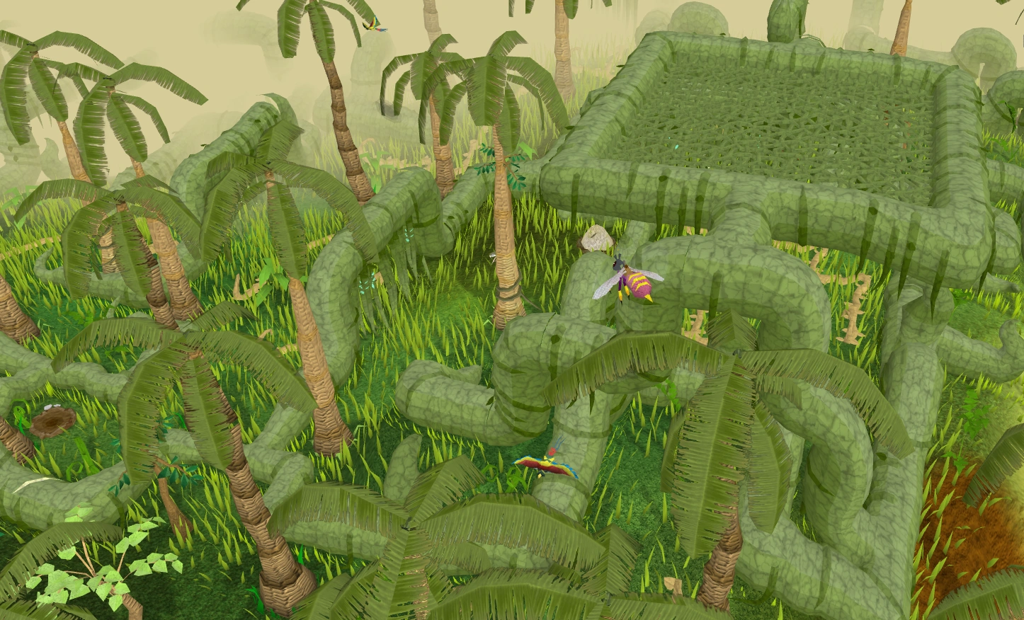
Reason: A confusing mass of green. It looks worse when viewed at the resolution that Featured images are shown at on the main page.
- Support - As nom. 222 talk 07:25, November 7, 2010 (UTC)
- Support - I think that, when this was nominated, players were allready playing hide & seek in that bunch of green. They still haven't been found... Fswe1 08:48, November 7, 2010 (UTC)
- RIP. JOEYTJE50TALK pull my finger 13:10, November 7, 2010 (UTC)
- I reverted it to the good version. "Reduced file size by indexing. Since this is a featured image, feel free to revert." well, i did, and compressed the good one. JOEYTJE50TALK pull my finger 13:10, November 7, 2010 (UTC)
- Strong support - Per ugly green massness. JOEYTJE50TALK pull my finger 13:10, November 7, 2010 (UTC)
- Oppose - --Iiii I I I 00:53, November 8, 2010 (UTC)
- Support - Too green. Suppa chuppa Talk 00:55, November 8, 2010 (UTC)
- Support - Green. bad_fetustalk 18:13, November 8, 2010 (UTC)
- Oppose - Per 7i. ----クールネシトーク 21:21, November 8, 2010 (UTC)
- He didn't even offer a reason... Lil cloud 9 Talk 23:54, November 10, 2010 (UTC)
- Support - A
hotgreen mess. Lil cloud 9 Talk 23:54, November 10, 2010 (UTC) - Support - per nom User:LordDarkPhantom/Signature 17:37, November 11, 2010 (UTC)
- Support
/Replace- The green mass of DOOM.
- REDIRECT User:-Matt/sig 21:08, November 11, 2010 (UTC)
- Support - Per all. Zap0i Talk 02:22, November 13, 2010 (UTC)
- Support - Per above. Even I'm supporting this, and I'm supposed to be the guy that likes green. User:Stelercus/Signature 14:04, November 14, 2010 (UTC)
- Closed - Nomination for delisting is successful. C.ChiamTalk 14:56, November 14, 2010 (UTC)
TzHaar city
Reason: Everything is made of two colours: orange and black. You cannot see the TzHaar "people", there is only the floor and the wall, uninteresting, dull, etc.
- Support - As Fswe1 on 14:42, November 8, 2010 (UTC)
- Oppose - It has a mysterious feel to it. bad_fetustalk 18:15, November 8, 2010 (UTC)
- Support - A complex and confusing maze of orange lines placed over a black floor, you can't see the image in it's entirety as it is obscured by the orange. 222 talk 05:38, November 9, 2010 (UTC)
- weak support - It is kinda ugly how they are in the middle of a movement, but it also has something nice about it... JOEYTJE50TALK pull my finger 11:05, November 9, 2010 (UTC)
- Oppose - Yes everything is made of two colours, because that is Tzhaar City! I think this image represents the Tzhaar City very well, it's also good quality and features many of the Tzhaar citizens. Anurin Talk · Sign! . 15:03, November 9, 2010 (UTC)
- Even though it is typical TzHaar City, we can dislike it. It's just like that this image is typical Mort'ton, but still we don't like it. It also features many Mort'ton citizens and that doesn't make it a more FIMGy image. JOEYTJE50TALK pull my finger 12:05, November 12, 2010 (UTC)
- You can't compare it to Mort'ton Even though it is typical Tzhaar City, we can like it. It's just like this image is typical Mort'ton, but we still like it. Haha just messing around Anurin Talk · Sign! . 23:34, November 14, 2010 (UTC)
- Joey, tbh, I'd support that image's fimg. bad_fetustalk 12:06, November 15, 2010 (UTC)
- You can't compare it to Mort'ton
- Oppose - Makes me nauseous, but it looks of FIMG quality. ----クールネシトーク 20:39, November 9, 2010 (UTC)
- Support - That was FIMG quality before the ooo was released. —The preceding unsigned comment was added by Sentra246 (talk) on 10:39, November 10, 2010 (UTC).
- Oppose - I don't think there's any getting around the colors because that's just how Tzhaar is. Lil cloud 9 Talk 23:57, November 10, 2010 (UTC)
- Plz read my comment to ElfAnurin's oppose, as "that's just how Mort'ton is" is no reason to feature the image imo. JOEYTJE50TALK pull my finger 12:25, November 14, 2010 (UTC)
- Oppose - Epic camo, LOL Zap0i Talk 02:25, November 13, 2010 (UTC)
- Notice of intent - Nomination extended until November 22, 2010. --LiquidTalk 02:34, November 15, 2010 (UTC)
- Closed - - Nomination for delisting is unsuccessful; lack of consensus. C.ChiamTalk 13:58, November 22, 2010 (UTC)
RFD
Reason: i dont like.
- Support - As nominator. JOEYTJE50TALK pull my finger 17:05, November 25, 2010 (UTC)
- Neutral - I like this image, and it has characteristics of a good Featured Image. Unfortunately, this image is best viewed at full size, not the smaller render on the Main Page. 222 talk 09:04, November 26, 2010 (UTC)
- Oppose - I actually saw this on the front page today and had a look at it and thought that's a pretty good picture. Sentra246 09:09, November 26, 2010 (UTC)
- Oppose - I like this image a lot, and you haven't really got a good reason. Fswe1 13:42, November 26, 2010 (UTC)
- Wai? isnt the fact i dont like not a good reason? JOEYTJE50TALK pull my finger 15:11, November 26, 2010 (UTC)
Oppose - Frankly, I find that image to be amazing. The only thing I don't like about it is that you can see the player. bad_fetustalk 14:03, November 26, 2010 (UTC)
- Oppose - "I don't like" is not a good reason to delist, and I think the image is fine. Lil cloud 9 Talk 13:40, November 29, 2010 (UTC)
- Oppose - I quite like this image and its vivid colors. It's out of date, but that's not really a big deal. The Last Pun Talk 13:55, November 29, 2010 (UTC)
- Oppose - Per all. Tien 02:07, November 30, 2010 (UTC)
- Closed - Nomination is unsuccessful. --LiquidTalk 01:26, December 2, 2010 (UTC)
Mask of Dragith Nurn

Reason: Not that impressive.
- Support - As nominator. User:LordDarkPhantom/Signature 12:47, December 25, 2010 (UTC)
- Strong oppose - That's one of my favourite fimgs. bad_fetustalk 15:33, December 25, 2010 (UTC)
- Strong support - I hated it when it was nominated, but was forced to put it up as an FIMG by the consensus system, and I don't like it now. --LiquidTalk 16:50, December 25, 2010 (UTC)
- Oppose - I like it. Coelacanth0794 Talk 00:40, December 26, 2010 (UTC)
- Neutral - It's nice, but a bit bland. Fswe1 07:27, December 26, 2010 (UTC)
- Weak oppose - It is quite small, but looks kinda cool too. JOEYTJE50TALK pull my finger 08:53, December 26, 2010 (UTC)
- Support - Unimpressive, bland, and has no interesting factor. 222 talk 11:35, December 26, 2010 (UTC)
- Oppose - I liked it... ----クールネシトーク 14:10, December 26, 2010 (UTC)
- Support - Wow it's a detailed picture of a mask. Sentra246 04:13, December 31, 2010 (UTC)
- Oppose - It looks kewl.
- REDIRECT User:-Matt/sig 06:02, December 31, 2010 (UTC)
- Strong Support - I was going to create a nomination for delisting about this until I saw one was already created. This image just not interesting and truly is missing the "wow" factor. Per Sentra246.Joel amos Talk Contribs 01:20, January 1, 2011 (UTC)
- Notice of intent - Deadline of nomination extended by a week to 8 January 2011. C.ChiamTalk 13:24, January 1, 2011 (UTC)
- Closed - Nomination for delisting is unsuccessful; lack of consensus. C.ChiamTalk 08:56, January 8, 2011 (UTC)
Dragith nurn
Reason: The image standards have risen. It has some strange combination of AA and not AA, which looks kinda ugly. I just don't really think this is a good FIMG anymore.
- Support - As nominator. JOEYTJE50TALK pull my finger 13:14, January 10, 2011 (UTC)
- Neutral - Still looks cool. I was going to retake it anyway. Gl on the Dwarf battlefield! :P Fswe1 15:29, January 10, 2011 (UTC)
- Oppose - Looks naise to me. bad_fetustalk 19:19, January 10, 2011 (UTC)
- Support - per nominator, although I don't see the non-AA parts? User:LordDarkPhantom/Signature 19:30, January 10, 2011 (UTC)
- They are at his mouth, mask, the left side of his ribs, and his left hand. That the rest is AA makes it look strange, which is not what i want of a FIMG JOEYTJE50TALK pull my finger 09:16, January 11, 2011 (UTC)
- Those are hardly visible at all, and the image on the mian page is resized so you cannot notice it at all. Though admittedly, it's not what you want from a FIMG. User:LordDarkPhantom/Signature 18:46, January 11, 2011 (UTC)
- These "standards" are what stops any image from being nominated. User:LordDarkPhantom/Signature 18:46, January 11, 2011 (UTC)
- Oppose - Looks fine. 222 talk 00:24, January 11, 2011 (UTC)
- Oppose - Per cool. Coelacanth0794 Talk 00:29, January 11, 2011 (UTC)
- Oppose - Looks cool. Sentra246 13:25, January 12, 2011 (UTC)
- Comment - could someone please explain to me what's so cool about it? i really don't see it... JOEYTJE50TALK pull my finger 21:36, January 13, 2011 (UTC)
- It's called an opinion. --クールネシトーク 22:01, January 13, 2011 (UTC)
- Yes, i know. But there are always things you like about an image. For example, i like it if something has good trans and AA, or if it has nice lighting. Could someone explain it to me please? JOEYTJE50TALK pull my finger 21:11, January 14, 2011 (UTC)
- They simply like the looks of the image. Most people don't care mostly about whether it's AA/nice lighting, but usually about the object. People seem to like the looks of this image. User:LordDarkPhantom/Signature 13:10, January 15, 2011 (UTC)
- Just so you know, i am not like checking if it has good things and only liking it if it does. Non-AA images can be good too. But it just adds to if i like it or not. I'm not going to argue about opinion, i was just curious. JOEYTJE50TALK pull my finger 13:30, January 15, 2011 (UTC)
- Oppose - Per everyone else.
- REDIRECT User:Urbancowgurl777/Signature 22:04, January 13, 2011 (UTC)
The Mask of Dragith Nurn
Reason - It's just a detailed picture of an item and not a very colourful or interesting one either
Nomination
First delisting nomination
- Support - As nom. Sentra246 08:00, January 29, 2011 (UTC)
- Comment - I don't think it's very handy to nominate this so shortly after the other nomination... Fswe1 08:46, January 29, 2011 (UTC)
- Support - Nothing particularly great about it. Samberen 08:18, January 29, 2011 (UTC)
- It's been almost a month since the last one was shut, plus I had forgotten about that when I found the image. Sentra246 08:55, January 29, 2011 (UTC)
- To clear it up, I knew there had been a previous nomination, but I thought it was months ago, not 1 month ago. Sentra246 00:35, January 30, 2011 (UTC)
- To clear it up, I knew there had been a previous nomination, but I thought it was months ago, not 1 month ago.
- It's been almost a month since the last one was shut, plus I had forgotten about that when I found the image.
- Oppose - As I stated on the previous nomination, it is one of my favourite fimg's. bad_fetustalk 09:26, January 29, 2011 (UTC)
- AMG CHESS LIEKS AA JOEYTJE50TALK pull my finger 22:03, January 29, 2011 (UTC)
- I improovd it fer ur AAphobia: [1] JOEYTJE50TALK pull my finger 22:07, January 29, 2011 (UTC)
- Much better ^.^ bad_fetustalk 18:19, January 30, 2011 (UTC)
- Nub. JOEYTJE50TALK pull my finger 15:41, January 31, 2011 (UTC)
- Much better ^.^ bad_fetustalk 18:19, January 30, 2011 (UTC)
- I improovd it fer ur AAphobia: [1] JOEYTJE50TALK pull my finger 22:07, January 29, 2011 (UTC)
- Strong support - Unimpressive, bland, and has no interesting factor. 222 talk 09:35, January 29, 2011 (UTC)
- Strong support - per nominator User:LordDarkPhantom/Signature 09:42, January 29, 2011 (UTC)
- Strong oppose - Per Chess. --クールネシトーク 13:19, January 29, 2011 (UTC)
- conditional support - If we get other item FIMGS in the place. Dragon equipment looks cool, dungeoneering equipment does, etc. We just need more item FIMGS. JOEYTJE50TALK pull my finger 21:47, January 29, 2011 (UTC)
- Why on Earth should other images affect this? If you believe that we should have other item FIMGs, then nominate them, don't let that affect your voting for this particular image. User:LordDarkPhantom/Signature 19:28, January 31, 2011 (UTC)
- Oppose - Pretty cool. Suppa chuppa Talk 21:50, January 29, 2011 (UTC)
- Oppose - Cool detail image. --Aburnett (Talk) 21:52, January 29, 2011 (UTC)
- Strong support - I was the one who featured it, and I hated it. --LiquidTalk 22:11, January 29, 2011 (UTC)
- Oppose - Metallic blue with a red gem, I leik itz. ScionCrush 04:03, January 30, 2011 (UTC)
- Moar oppose - It's nice 'cos it's simple, nothing flashy, nothing complicated. User:Real Not Pure/Signature 13:28, January 30, 2011 (UTC)
- Support - Just plain and ugly! Yojeez 00:38, February 1, 2011 (UTC)
- Even moar oppose - Per all.
- REDIRECT User:-Matt/sig 06:21, February 2, 2011 (UTC)
- Notice of intent - Deadline of nomination extended by a week to 12 February 2011. C.ChiamTalk 10:21, February 5, 2011 (UTC)
- Oppose - Looks creeeeepy. Fswe1 07:33, February 12, 2011 (UTC)
- Closed - Nomination for delisting is unsuccessful; lack of consensus. C.ChiamTalk 13:48, February 12, 2011 (UTC)
File:Ogre Enclave crystal.png
Reason - Boring, small, not up to the standards we have these days. Not any more interesting than a bunch of other scenery images we have.
Original nomination - RuneScape:Featured_images/archive7#Ogre_Enclave
Support - ʞooɔ 11:14, February 15, 2011 (UTC)
Support - Too cold and dark colors, not really interesting to see. JOEYTJE50TALK pull my finger 11:17, February 15, 2011 (UTC)
Support - Lamesauce. (Per cook) - [Pharos] 11:17, February 15, 2011 (UTC)
- Lamesauce? What does that taest liek? JOEYTJE50TALK pull my finger 13:28, February 15, 2011 (UTC)
Oppose - Shiny pretties... ![]() Fswe1 13:38, February 15, 2011 (UTC)
Fswe1 13:38, February 15, 2011 (UTC)
Support - Would look better if the picture featured more of the cave.. The crystal alone is kinda boring.
- REDIRECT User:Urbancowgurl777/Signature 13:39, February 15, 2011 (UTC)
Support - Old. --クールネシトーク 22:03, February 15, 2011 (UTC)
support - too dark and dreary![]() Pokmnbogroll Talk Adv log Sign here plawks and don't forget to vote 05:12, February 16, 2011 (UTC)
Pokmnbogroll Talk Adv log Sign here plawks and don't forget to vote 05:12, February 16, 2011 (UTC)
Support - Not shiny enough. ![]() 222 talk 05:20, February 16, 2011 (UTC)
222 talk 05:20, February 16, 2011 (UTC)
Oppose - I thought it looked cool. User:LordDarkPhantom/Signature 19:59, February 18, 2011 (UTC)
Support - To dark and not very bright. ![]() Sentra246
Sentra246![]() 07:16, February 20, 2011 (UTC)
07:16, February 20, 2011 (UTC)
- >.< Fswe1 11:13, February 20, 2011 (UTC)
- You know I already said in the IRC that this nom would be a nice place for you to say that? SENTER, Y U READ MY MIND? JOEYTJE50TALK pull my finger 09:47, February 21, 2011 (UTC)
Closed - ![]() Successful nomination is successful. --Andorin (Talk) (Contribs) 09:55, February 22, 2011 (UTC)
Successful nomination is successful. --Andorin (Talk) (Contribs) 09:55, February 22, 2011 (UTC)